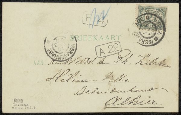
ink, pen
portrait
ink
pen
calligraphy
Copyright: Rijks Museum: Open Domain
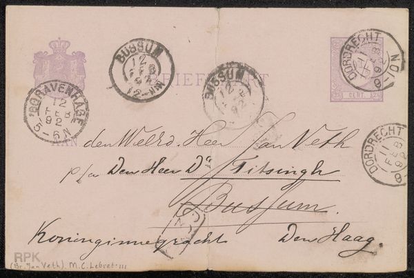
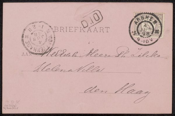
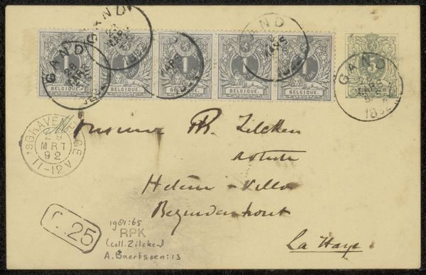
Curator: Before us, we have a postcard from Hendrik Albert van Trigt to Ary Johannes Lamme, likely dating to 1894. The materials are simply pen and ink. Editor: My first impression is one of quiet communication. It feels like a preserved whisper across time, mostly due to its monochromatic palette and small scale. The calligraphic hand adds a real grace note. Curator: Indeed. The choreography of the penstrokes creates a visual texture almost separate from the informational content. Note how Van Trigt varies line thickness to define spatial relationships, how the letterforms dance but are clearly legible. We must recognize the role handwriting once had as a decorative practice for all educated classes. Editor: You're focusing on form, but the socio-political implications are fascinating. The stamps are small but official markers of connection within the Netherlands. This document represents systems of postal administration, literacy rates, and geographic reach during the period. Curator: Granted, context always enriches, yet look how the placement of each postmark seems to purposefully echo and augment the visual rhythm created by the looping script below. Van Trigt clearly understands how to activate all aspects of a pictorial field. Editor: Are you perhaps over-reading his intentions? Might that just be happenstance given where stamps were usually affixed? Curator: Perhaps, but I'm more taken by how even something as quotidian as an address can be rendered artistically significant through deliberate application of form. That merging is where the true power resides. Editor: For me, the true power sits in the tangible, physical link between people and how institutions, even through stamps and postal marks, facilitated that link, even back then. It all seems rather moving now given how digitized communication has become. Curator: A fair point. So we move beyond only regarding letterforms as vessels of content, and allow them be elevated to an element of the beautiful on par with a flourish or a curlicue. That will allow viewers to further respect Van Trigt and the legacy he created here in ink. Editor: I concur, we've come to realize this artwork is less about who Van Trigt and Lamme were and more a moment when we can see the importance of connectivity, from any time, whether past, present or future.
Comments
No comments
Be the first to comment and join the conversation on the ultimate creative platform.
More like this