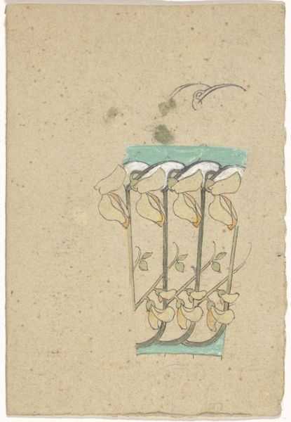
Dimensions: 7 11/16 x 4 15/16 in. (19.5 x 12.6 cm)
Copyright: Public Domain
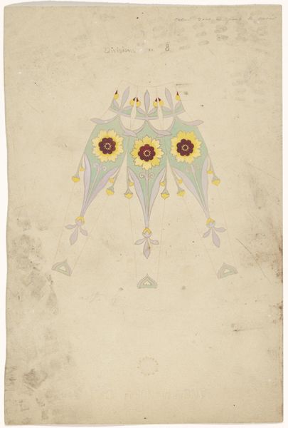
Curator: This is a fascinating design attributed to Jacques Caillot, dating roughly between 1835 and 1905. The piece, entitled "Design for a Haircomb," employs watercolor, colored pencil, and pencil on paper. Editor: The contrast is striking. The deliberate juxtaposition of the finished and unfinished parts gives it an air of incompleteness—like a memory half-formed. What really stands out is this powerful yin and yang, with the stark black and white swans nestled together, head to head, beak to beak. Curator: The symmetry is indeed notable, almost perfectly bisected, with the swans acting as the focal point. The swans themselves adhere to distinct colour schemes and stylization, a common thread in decorative Art Nouveau from this period. It has an almost heraldic feel, does it not? Editor: Absolutely. It speaks to late 19th century aesthetic sensibilities where decorative art elevated everyday objects into symbols of deeper social meaning and gender roles. Consider that the comb—often a woman's object— becomes charged with duality, hinting at the complexities within feminine identity. And notice, there are very soft, blurred edges here, almost like we’re observing the artwork underwater. Curator: A fitting interpretation, given the aquatic motifs. The watery tendrils suspended from the lotus offer that flowing element so beloved in Art Nouveau. Observe also how each section–the swans, lotus and water—is bordered by strong, yet decorative lines, creating these distinct but equally beautiful spaces. Editor: But let’s think of that pairing a little deeper. Black and white--good and evil-- perhaps a reference to marriage equality within this late 19th and early 20th century society? Even this comb presents that juxtaposition as it served not only aesthetic uses but had symbolic status of a particular relationship to privilege and fashion within the context of class. Curator: Fascinating perspective. Viewing it from a purely structural perspective though, consider how this symbolic opposition functions within the design's visual economy. The carefully calibrated contrast draws the eye and offers visual balance, emphasizing a highly stylized organic harmony above all else. Editor: I agree that tension provides a deeper, nuanced perspective on identity, design and purpose, prompting an appreciation for that convergence. Curator: It's certainly a powerful synthesis of form and symbolism that captures both aesthetic trends of the period, offering a glimpse into the artist’s methods.
Comments
No comments
Be the first to comment and join the conversation on the ultimate creative platform.
More like this