Copyright: Public Domain
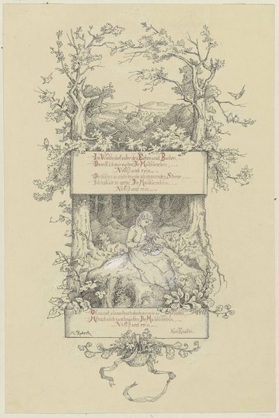
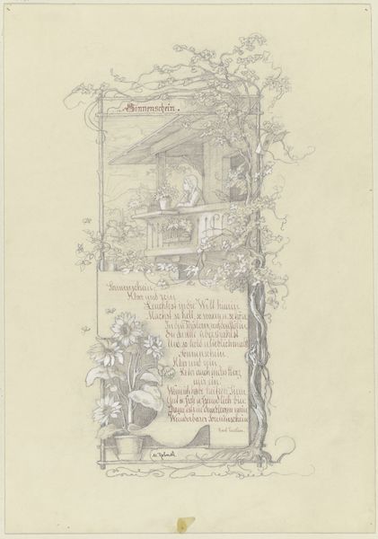
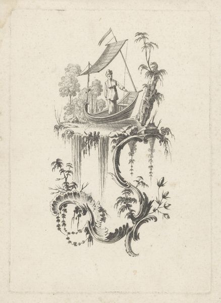
Curator: "Better is better," created in 1894 by Minna Roberth. What captures your eye initially about this drawing? It feels like a scene from a storybook with such a tender tone, wouldn't you agree? What’s your take? Editor: I am drawn to how detailed yet contained the landscape is. The intricate details really create the romantic mood. I'm curious about the title. How do you interpret this work in light of what seems like a very deliberate arrangement of imagery? Curator: It's interesting that you pick up on the contained feeling. Think about how artwork was often displayed at that time, salon-style, packed together. This piece, likely a personal sketch, comments on the desire for something 'better' against a backdrop of social expectation and limited roles, particularly for women. Do you notice how the text is integrated? Editor: I do! The calligraphy seems very deliberate. Is the poem directly connected to Roberth's own feelings about her social position? Curator: Potentially. Artists like Roberth often critiqued societal norms subtly. Romanticism in general, as a movement, emphasized feeling and individual experience against Enlightenment rationalism. Here, the idyllic landscape contrasts the longing expressed in the verse. Also notice how she signs her name! Editor: Ah, yes! That personal touch! This drawing speaks volumes about individual aspiration versus the constraints of society, doesn’t it? Curator: Indeed. It’s a quiet rebellion, expressed through a very intimate and carefully crafted image. Reflects the sociopolitical landscape without explicitly stating it. Editor: Thanks, I hadn’t considered it in this socio-historical light; it’s provided so much new context to the themes she explores.
Comments
No comments
Be the first to comment and join the conversation on the ultimate creative platform.
More like this