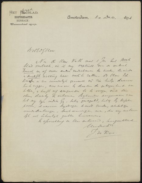
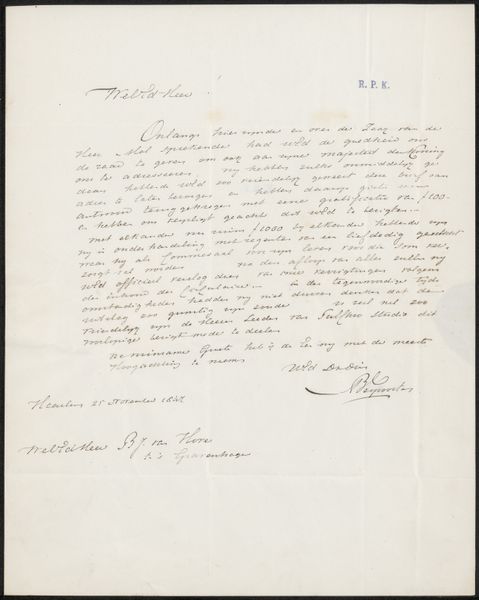
drawing, paper, ink
#
drawing
#
dutch-golden-age
#
paper
#
ink
#
modernism
#
calligraphy
Copyright: Rijks Museum: Open Domain
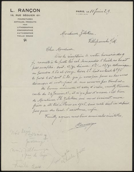
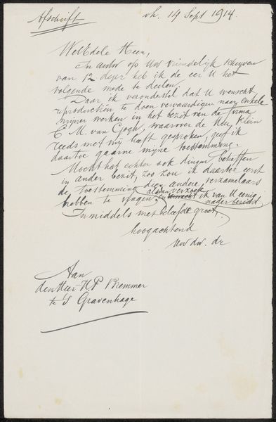
Curator: This is "Brief aan Max Dittmar Henkel" – or "Letter to Max Dittmar Henkel" – by Jan Rinke, likely from 1913. It's a drawing in ink on paper, showcasing Rinke's engagement with both modernism and the tradition of Dutch Golden Age calligraphy. Editor: Immediately, I'm struck by how fragile the whole thing feels. The thinness of the lines, the faded ink, it’s as if I’m looking at a whispered secret captured on paper. Curator: That's a good observation. Rinke, who was associated with the Amsterdamse School movement, often explored themes of social progress and national identity. The letter format, the careful script… It speaks to a time when correspondence was a considered art form, reflecting social structures. Editor: Yes, and the act of writing itself, the materiality of ink and paper, becomes a performance. You can almost imagine Rinke carefully crafting each stroke, aware of the recipient and the weight his words might carry. It seems to engage themes like communication as labour, as well as his investment into formal writing. Curator: Precisely. The letter is addressed to Max Dittmar Henkel, an assistant at the Rijks prentenkab… this suggests Rinke was attempting to communicate with institutions related to arts and design, using this letter as evidence of experience or knowledge. The fact that it is addressed to someone from an official bureau suggests Rinke saw these types of interactions as part of the job for artists. Editor: The flowing script really catches the eye, almost resembling abstract patterns rather than conventional text, thus highlighting the aesthetic of calligraphy, bringing artistry to written communication and hinting that there were even higher considerations than just functionality. Curator: Considering its modernist and Golden Age calligraphy influences, I agree that Rinke seems to intentionally play with legibility, blurring the line between communication and artistic expression. The Dutch context adds another layer, recalling a tradition of meticulous detail in everyday objects and visual materials. Editor: For me, thinking about Rinke's choice of a handwritten letter connects it to a wider culture of personalized objects, demonstrating artistry at a small scale and communicating intimacy to a specific audience through ink and script. It speaks to more than institutional goals. Curator: Absolutely. Viewing this letter, I find myself considering the changing roles and value judgements about an object, depending on how it changes social or artistic positions. Editor: And for me, the work offers a reminder that there’s an almost tactile quality to correspondence, a materiality easily lost in the digital age.
Comments
No comments
Be the first to comment and join the conversation on the ultimate creative platform.
More like this