carving, metal, relief, sculpture
#
portrait
#
carving
#
metal
#
relief
#
sculptural image
#
11_renaissance
#
sculpture
#
history-painting
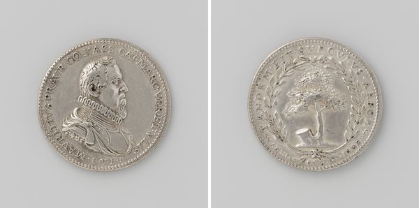
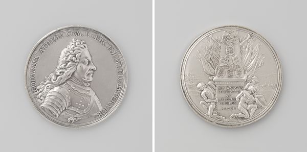
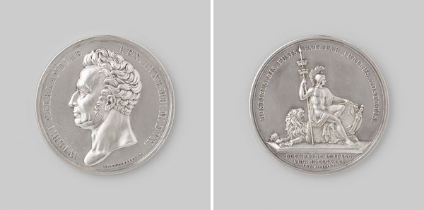
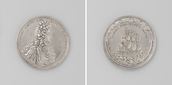
Dimensions: diameter 4.8 cm, weight 44.74 gr
Copyright: Rijks Museum: Open Domain
Editor: This is a Renaissance relief from 1585 by Jacques Jonghelinck. It seems to be carved from metal, and depicts the Erezuil erected for the Duke of Parma. It’s presented in two-sided format, kind of like a coin. The piece feels... official, almost cold. What do you see here? Curator: Ah, yes, the icy touch of power! You've hit upon something vital. Consider it as not just metal, but a deliberate casting of history itself. A snapshot of victory, wouldn't you say? Look how meticulously the artist renders both the Duke’s strong profile on one side and the triumphal column on the other. The coin's material lends it this… enduring quality. Almost as though saying, "This victory? This is permanent." Does it make you question whose version of the story we're being sold? Editor: Definitely. I noticed the laurel wreath on the reverse side too – more symbols of victory, right? It’s interesting how insistent it is. And it almost feels propagandistic. Were these types of objects commonly circulated? Curator: Precisely! Circulated, yes, but perhaps more importantly, *controlled*. They served as pocket-sized billboards, solidifying power in tangible ways. What strikes me, though, is Jonghelinck's technical skill. Feels he's trying to trap history into perfection. Think of the lives behind this piece, the cost! Doesn't the coldness feel like the price of that perfect moment in time? Editor: It really does change how I see it now. It is very intentional! The artist almost wants you to feel something through propaganda, whether or not it is ethical. Curator: And now you start thinking, how differently would a civilian at the time interpret such a coin? That gap, that friction between intended message and received message… that’s where the real art history often resides, wouldn't you say? Editor: Absolutely. Thanks, that makes a lot of sense!
Comments
No comments
Be the first to comment and join the conversation on the ultimate creative platform.
More like this