Copyright: CC0 1.0
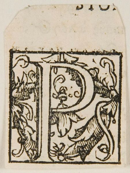
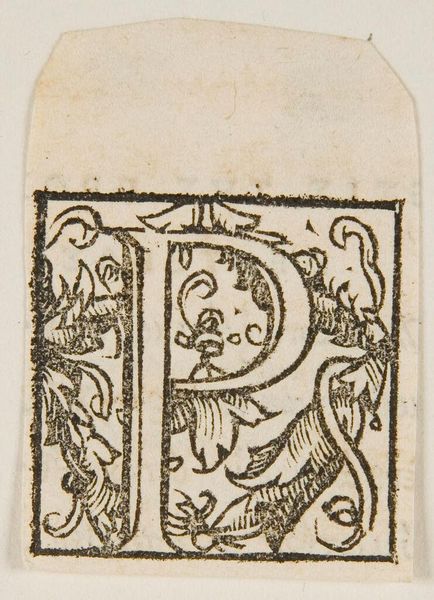
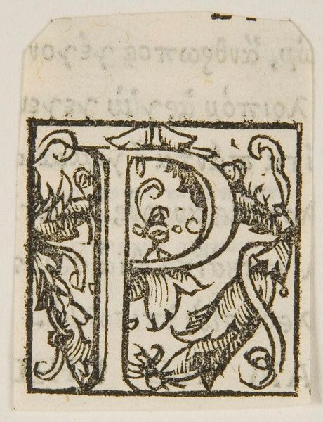
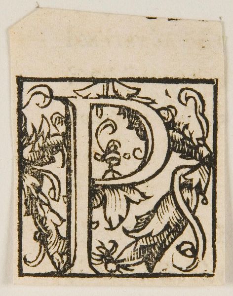
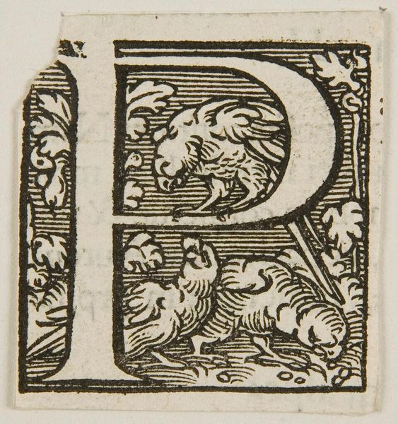
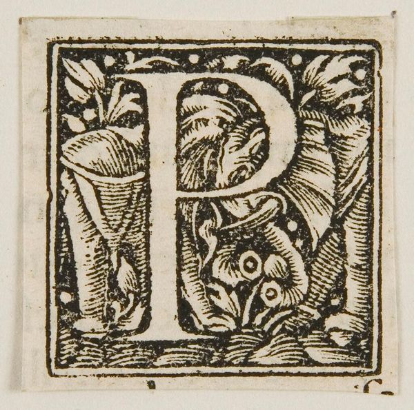
Editor: This is Letter P, by an anonymous artist. The linework creates a very decorative feel to something as simple as a letter. What do you see in the composition? Curator: I notice the interplay between positive and negative space. The black ink defines the letterform and the surrounding organic shapes, but the white space within these elements is equally crucial. It guides the eye and creates a sense of balance and visual interest. Editor: So the shapes within are just as important as the letter itself? Curator: Precisely. Consider how the curving lines and leaf-like motifs echo the shape of the "P," creating a cohesive visual language. Notice also the density of detail versus the plain background. Editor: It's amazing how much can be analyzed in such a small piece! Curator: Indeed, even a seemingly simple design reveals layers of complexity when we examine its formal elements closely.
Comments
No comments
Be the first to comment and join the conversation on the ultimate creative platform.
More like this