before 1919
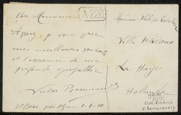
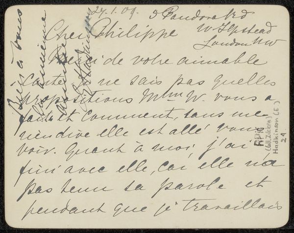
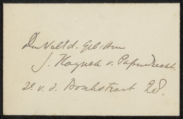
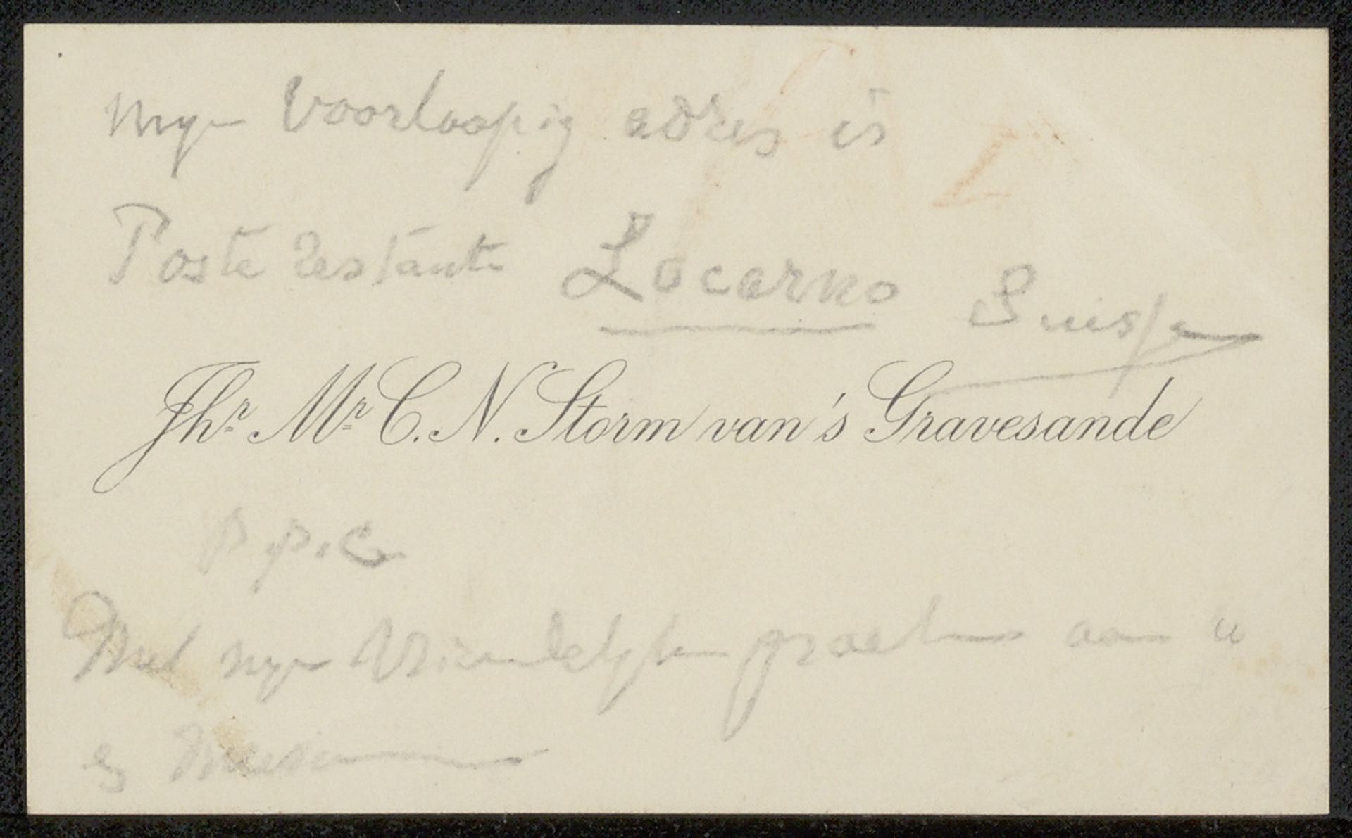
Visitekaartje aan Philip Zilcken
Carel Nicolaas Storm van 's-Gravesande
1841 - 1924Location
RijksmuseumListen to curator's interpretation
Curatorial notes
Carel Nicolaas Storm van 's-Gravesande made this visitekaartje, or visiting card, to Philip Zilcken with ink on paper. It's got a casual, almost ephemeral feel, right? Like a quick thought jotted down. I’m drawn to the materiality of the piece. It’s all about the surface and the marks on it. The ink is so delicate, almost faded, and the paper looks thin, like it could crumble in your hands. The cursive handwriting loops and swirls across the card. I see the way the ink bleeds a tiny bit into the paper, softening the edges of the letters. You can almost feel the pressure of the pen on the paper. The overall effect reminds me of Cy Twombly's work. Both artists share a love for the gesture, the scribbled line, and the beauty of imperfection. Like Twombly, van 's-Gravesande seems to embrace the raw and unfiltered expression of a moment. It’s like we’re catching a glimpse into the artist’s mind.