drawing, paper, ink, pen
#
portrait
#
drawing
#
comic strip sketch
#
pen sketch
#
hand drawn type
#
paper
#
personal sketchbook
#
ink
#
ink drawing experimentation
#
pen-ink sketch
#
pen work
#
sketchbook drawing
#
pen
#
storyboard and sketchbook work
#
post-impressionism
#
sketchbook art
Copyright: Rijks Museum: Open Domain
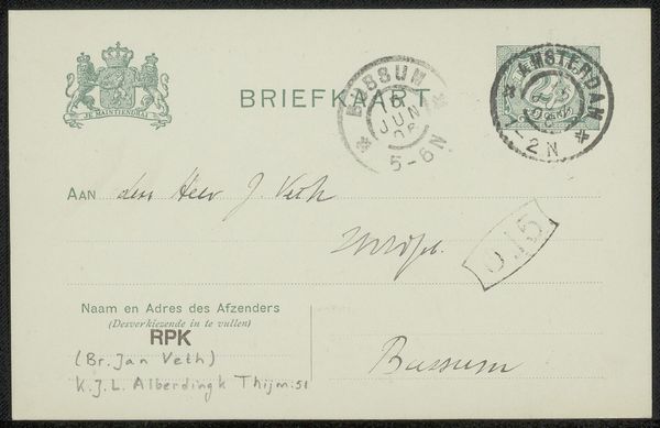
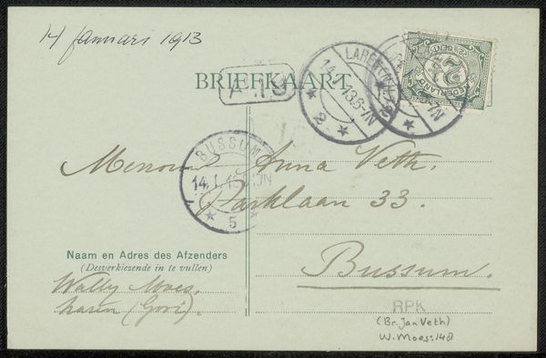
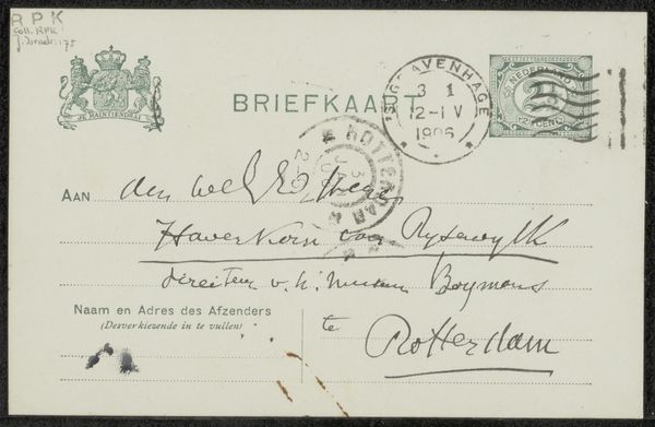
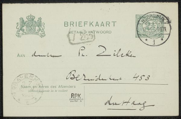
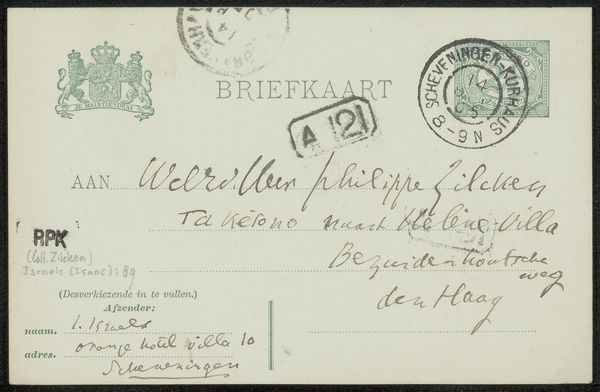
Editor: Here we have "Briefkaart aan Jan Veth," possibly from 1905, by Karel Johan Lodewijk Alberdingk Thijm, created using ink and pen on paper. I’m struck by the variety of writing styles – some very neat, some almost scribbled. What stands out to you in terms of the form of this piece? Curator: The juxtaposition of differing textual applications certainly piques interest. Note the contrast between the formality of the printed 'BRIEFKAART' and the casual script that permeates the rest of the surface. How does the variance in lettering style guide the eye and shape your understanding? Editor: Well, the printed words seem like just part of the stationary, and the handwritten parts, along with the stamps and notations like ‘C13’, seem more important because someone actually chose to write or stamp them, suggesting it has meaning. Curator: Precisely. We observe an integration of prefabricated elements and personal expression, mediated through varied modes of inscription. The structural contrast draws our attention to the intentionality of each mark. Consider how the balance and arrangement contribute to an overall sense of compositional harmony, or disharmony, reflecting potentially complex relationships. How does the relationship between text and image shape your perspective? Editor: The text *is* the image, in a way! I hadn't thought of it like that, but it makes the postcard feel more immediate, like a snapshot of someone's thoughts. The use of varying forms, script against type, is like a layer of intention. It reflects how different kinds of messages all fit together, on this small canvas, the composition as a form. Curator: Indeed. It seems this correspondence provides insight not merely into its literal content, but into the formal language inherent in its material construction. A fascinating exercise in communication, wouldn’t you agree? Editor: I certainly do. It’s incredible to consider that an everyday object like this postcard can be appreciated for its artistry.
Comments
No comments
Be the first to comment and join the conversation on the ultimate creative platform.
More like this