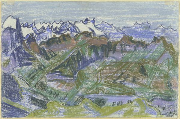
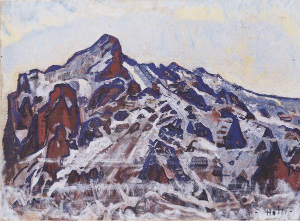
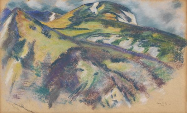
coloured-pencil
#
coloured-pencil
#
landscape
#
coloured pencil
#
geometric
#
modernism
Copyright: Public Domain: Artvee
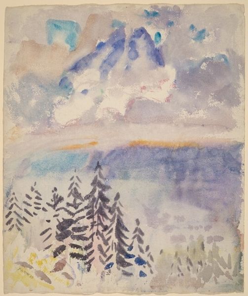
Curator: This is Reijer Stolk’s “Berglandschap,” created in 1936. It's crafted with coloured pencil. I'm struck by how Stolk manages to create such a textured landscape with a medium often associated with childhood. Editor: My initial feeling is that this work possesses a quiet tension, a constrained expression, typical of the 1930s, which was a really charged moment politically and socially. There's almost an intentional naiveté clashing with the reality of what was happening in Europe at that moment. Curator: Absolutely, and the colored pencil choice—such a quotidian, mass-produced material—directly opposes the romanticized landscapes of earlier eras, reflecting a more democratic engagement with art production. The very application of the color, almost cross-hatched, reinforces this sense of constructed labor. Editor: I agree, that repetitive mark-making does call attention to the labor invested in its production. However, I see it connecting with broader narratives as well; those simplified, geometric forms can also echo the rise of totalitarian ideologies of the period. What seems childlike in the materials might serve as a commentary on manipulated perceptions and simplified worldviews that appeal to broader social and political issues. Curator: I hadn't considered the ideological connection so directly, but now it seems obvious! I’m thinking about what a colored pencil drawing signifies in the broader context of art consumption at the time; who was art *for*, who was *making* art, and why choose such a seemingly un-precious material for a subject that had historically been presented in oils by the masters? Editor: And maybe Stolk critiques the pastoral ideal. By presenting it with these accessible tools and these flattened perspectives, the romantic landscape, the kind seen in advertising or governmental propaganda posters, is recontextualized as a manipulated projection instead of something inherently ‘pure’. It’s forcing us to reflect on what such idealized landscape images might conceal. Curator: It really challenges assumptions about high art versus accessibility, and by extension, about the relationship between art, labor, and social class in pre-war Europe. Editor: The tension lies in the subtle disruption, urging viewers to question the apparent calm and simplicity within the composition and its historical period. It invites interrogation, even unease. Curator: It shifts your understanding completely. Thank you for expanding my understanding of the drawing’s context. Editor: A necessary provocation, given the seemingly peaceful, uncomplicated appearance of the landscape, don’t you think?
Comments
No comments
Be the first to comment and join the conversation on the ultimate creative platform.
More like this