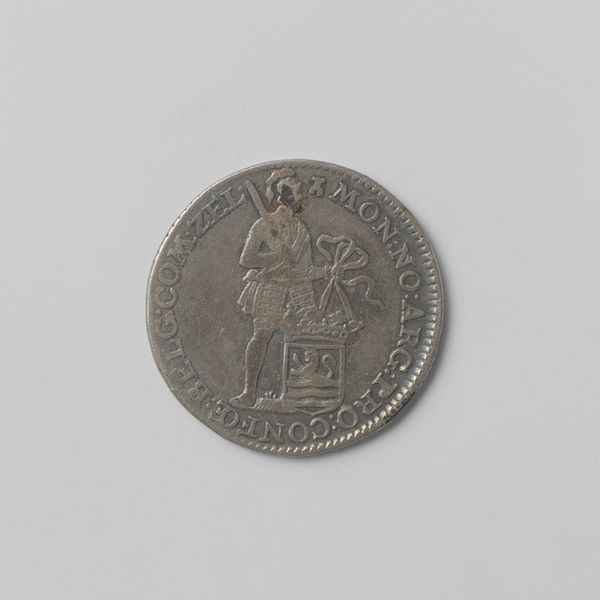
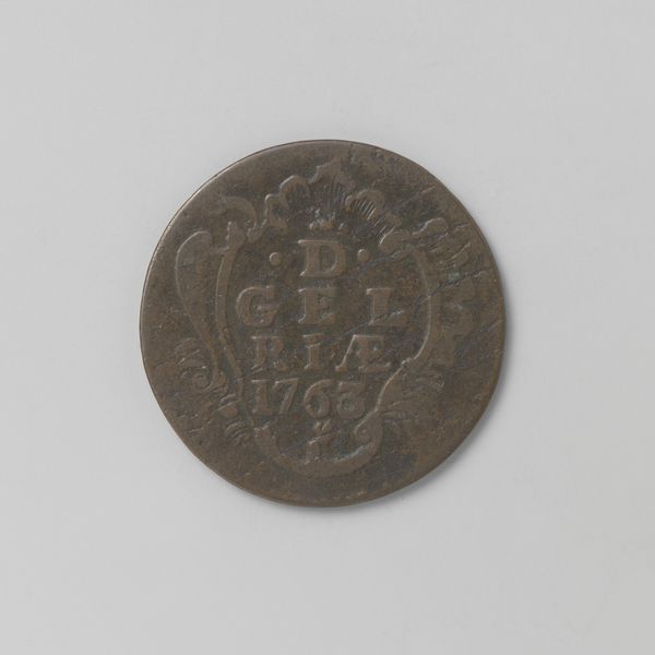
print, metal, relief
#
medieval
# print
#
metal
#
relief
#
geometric
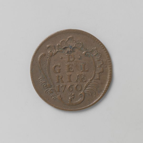
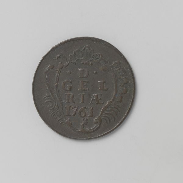
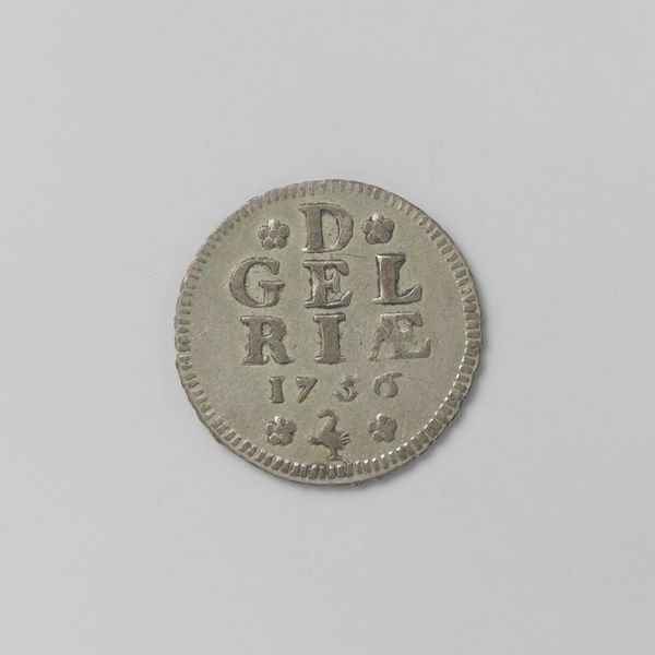
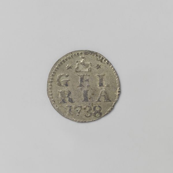
Dimensions: diameter 2.2 cm, weight 3.17 gr
Copyright: Rijks Museum: Open Domain
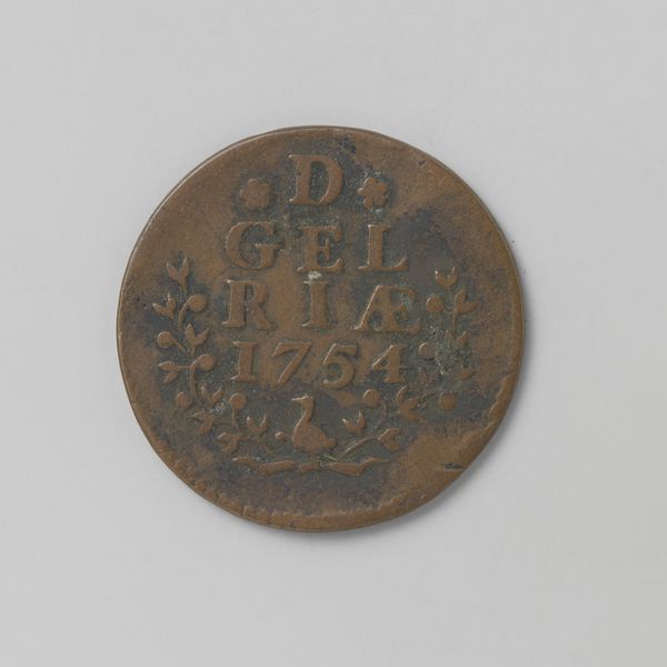
Editor: Here we have a Gelderse duit from 1759. Crafted from metal using a relief print technique, it's surprisingly ornate for a coin. How do you interpret its visual structure? Curator: Let us focus on the formal aspects. Notice the symmetrical arrangement of the inscription “D. GELRIÆ 1759” framed within what appears to be a shield or cartouche. The stylized floral elements act as counterpoints, balancing the geometric regularity of the text. What effect do you think the patina has on the overall design? Editor: It softens the geometric elements and obscures fine details. Does the wear and tear add to or detract from its aesthetic value? Curator: Indeed, that's a crucial point. The coin’s physical degradation contributes a layer of texture and, arguably, depth. We might consider the contrast between the deliberate artistry of the coin's design and the chance operations of its existence. Does the medium itself, metal, speak to the design and function? Editor: Absolutely. The choice of metal underscores its function as currency, but the relief printing transforms a simple object into a miniature sculptural form. I suppose it's about how art can be embedded into our everyday life, isn't it? Curator: Precisely. Considering its intrinsic qualities and historical context lets us consider art through its pure, abstracted form. Editor: I see it differently now. The arrangement of text and ornament creates a compelling visual narrative beyond mere monetary value. Curator: Good, that shows there’s always more than one valid method of engaging with artworks!
Comments
No comments
Be the first to comment and join the conversation on the ultimate creative platform.
More like this