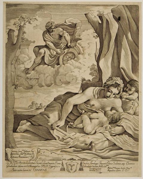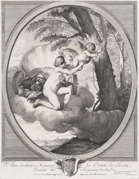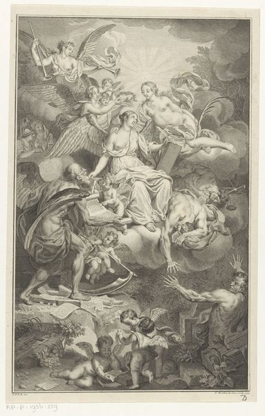
1622
Liefde (Caritas)
Listen to curator's interpretation
Curatorial notes
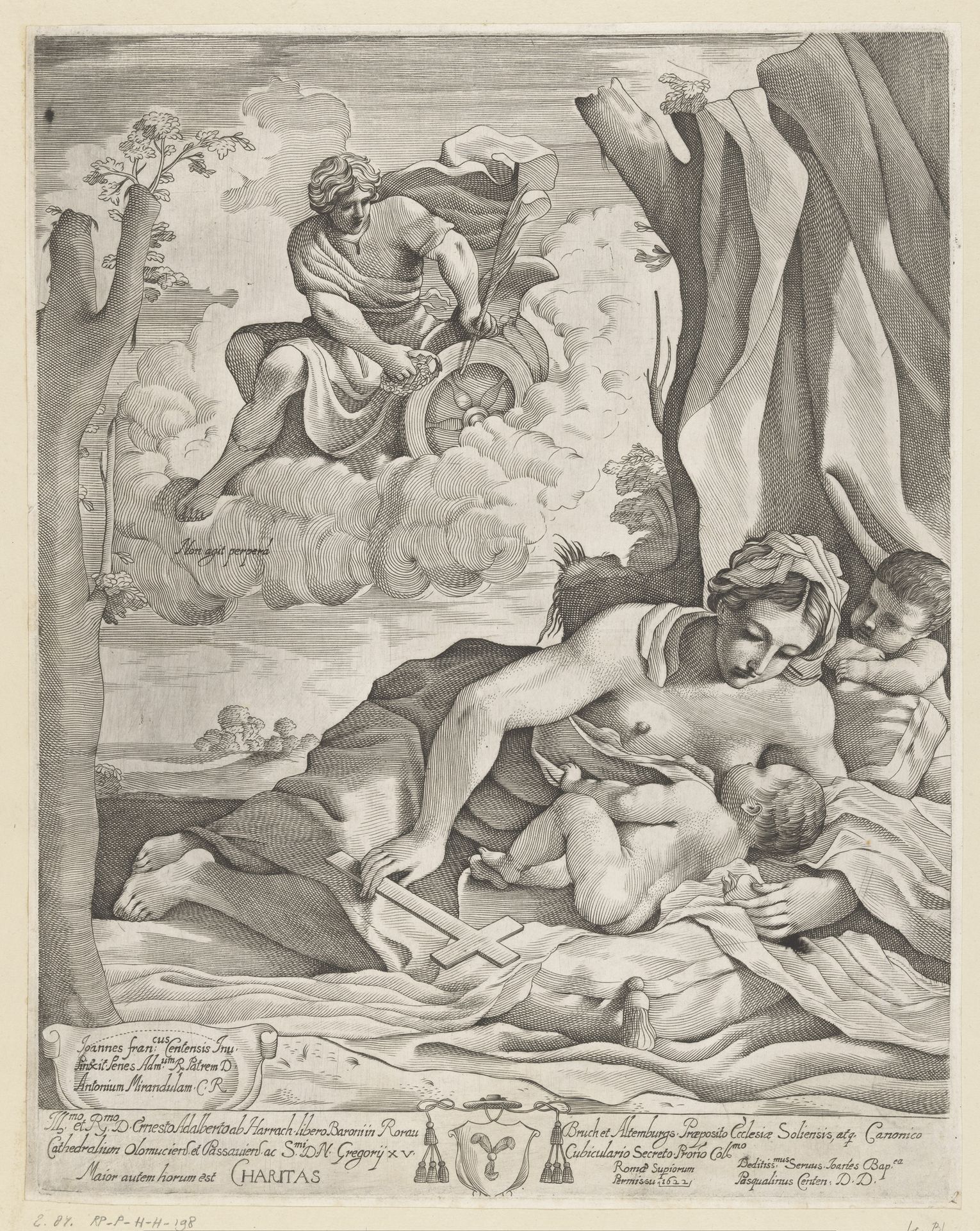
Editor: This is Giovanni Battista Pasqualini’s 1622 engraving, "Liefde (Caritas)." The stark contrasts really grab your attention. It’s packed with figures, but the composition feels very deliberate, almost mathematical. What stands out to you formally in this piece? Curator: The interplay of line and form certainly dictates the reading of this work. Note the sharp delineation, characteristic of engraving, defining each figure and object. This clarity lends itself to a rigorous, almost diagrammatic articulation of space. Consider the pyramidal structure: the maternal figure at the base, rising to the celestial figure above. The artist carefully guides the viewer's eye, but to what effect? Is it successful at harmonizing the earthly and divine realms, or does it create a sense of visual imbalance? Editor: I think the linear precision almost flattens the space. The clouds beneath the top figure feel… separate, somehow. Curator: Precisely! Observe the stark contrast in textures: the soft, rounded forms of the bodies juxtaposed with the harsh, angular lines of the clouds and drapery. Does this visual discordance, then, contribute to or detract from the symbolic harmony intended by the artist? What relationship do you perceive between these elements? Editor: It feels like a deliberate tension. The textures push and pull at each other, heightening the allegory's complexity. Thank you, that changed how I see the figures as relating to each other. Curator: Indeed. Appreciating this formal dichotomy encourages a deeper appreciation of Pasqualini's skillful control over visual language and his engraving work as a symbolic carrier.