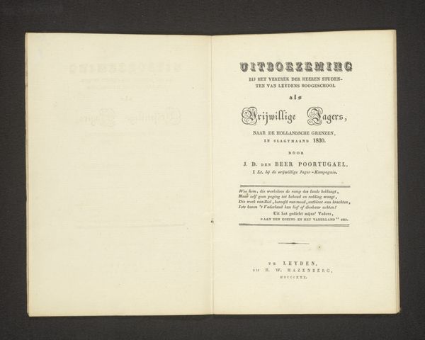
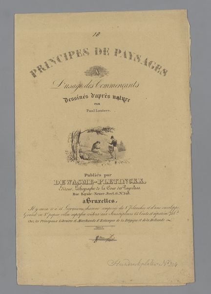
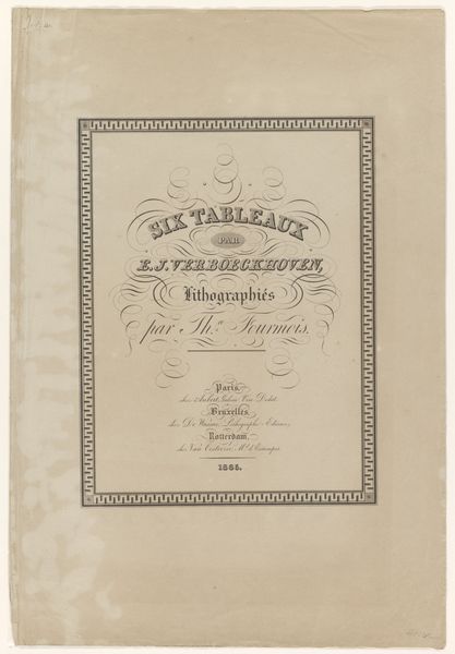
Omslag voor Principes de Fleurs et de Fruits l'Usage des Commencants 1824 - 1881
elisetheresedaiwaille
Rijksmuseum
graphic-art, print, typography, engraving
graphic-art
typography
fruit
engraving
Dimensions: height 305 mm, width 250 mm, height 305 mm, width 490 mm
Copyright: Rijks Museum: Open Domain
Editor: Here we have "Omslag voor Principes de Fleurs et de Fruits l'Usage des Commencants", a typographical print by Elise Thérèse Daiwaille, created sometime between 1824 and 1881. It has such an understated feel, almost academic in its presentation. What strikes you when you look at this piece? Curator: You know, it's funny, the first thing that comes to mind isn't flowers and fruits, though they're right there in the title, isn't it? It’s the sheer elegance of the lettering. It’s a dance of serifs and curls, a whisper of sophistication from another age. I can almost feel the engraver's hand, the pressure, the precision. Do you think this precision is what gives it that "academic" feel you picked up on? Editor: Absolutely, and perhaps also because it feels like a page out of an instructional manual or a textbook. It feels so formal and studied. Curator: Indeed. Think about it, a "principle" of flowers and fruits is almost scientific, isn’t it? Yet rendered with such flourish. There's a gentle tension between the objective and the ornamental. And that little wreath at the top – it adds a touch of celebration, doesn’t it? Like a little wink acknowledging the joy of creation, or perhaps of understanding the natural world? Editor: I love that idea. It definitely elevates it from just a textbook cover to something a little more playful and considered. I guess the artistry lies in combining utility with elegance! Curator: Precisely! It’s a reminder that even the most functional of objects can possess beauty and, perhaps, even reveal something of the soul behind the hand that crafted it.
Comments
No comments
Be the first to comment and join the conversation on the ultimate creative platform.