print, engraving
#
baroque
# print
#
line
#
decorative-art
#
engraving
Dimensions: height 439 mm, width 270 mm
Copyright: Rijks Museum: Open Domain
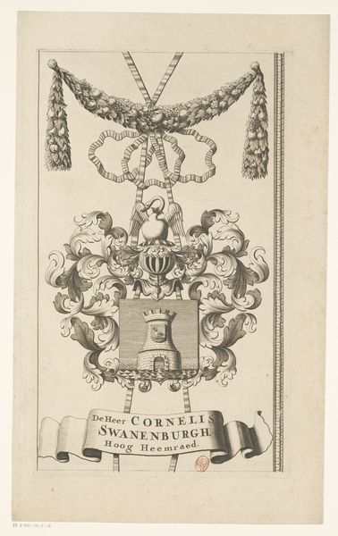
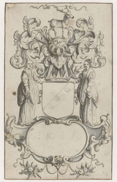
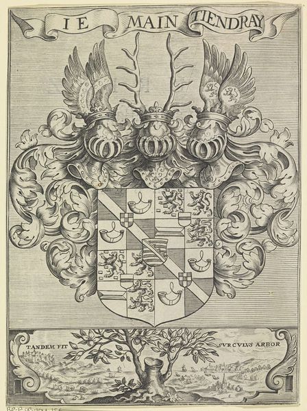
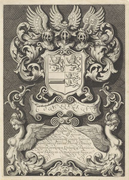
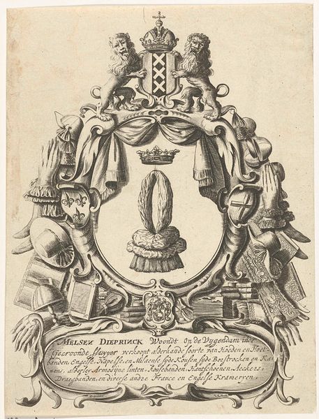
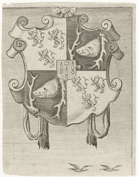
Editor: This is a section of "Kaart van het Hoogheemraadschap van de Krimpenerwaard," made between 1683 and 1706, an engraving, unsigned. The level of detail is quite astounding. How would you interpret this work, looking closely at its forms? Curator: Indeed, the fine lines and intricate details invite close observation. As a formalist, I'm drawn to how the artist uses line to create a sense of depth and texture. Notice the contrasting textures—the smooth surfaces of the shield, the density of the foliate ornaments. How do these different qualities play with the viewer's perception? Editor: It’s almost hyper-realistic despite being, well, linear. So, you are more interested in the shapes, forms, and textures than any possible symbolism? Curator: Precisely. Consider the composition: the symmetry of the crest juxtaposed with the asymmetrical garland. These compositional choices invite us to examine the artwork not as a symbolic representation of something else but as a self-contained visual experience. What do you observe about the relationship between the decorative border on the left, the garland at the top and the more dense coat-of-arms below? Editor: It appears quite deliberate...as if each part vies for our attention, and they’re all linked to make you move around. Curator: Indeed. That interplay directs our gaze and dictates the visual rhythm. The artist’s conscious manipulation of visual elements generates interest in the forms themselves. We analyze art based on its visual elements: color, composition, texture, and form, with no cultural or historical consideration. Editor: This gives me so much to consider as I study the artwork! Curator: Exactly. Analyzing art from a structural perspective truly changes how we perceive it.
Comments
No comments
Be the first to comment and join the conversation on the ultimate creative platform.
More like this