graphic-art, print, paper, typography
#
graphic-art
# print
#
book
#
paper
#
typography
Dimensions: height 270 mm, width 190 mm, thickness 31 mm
Copyright: Rijks Museum: Open Domain
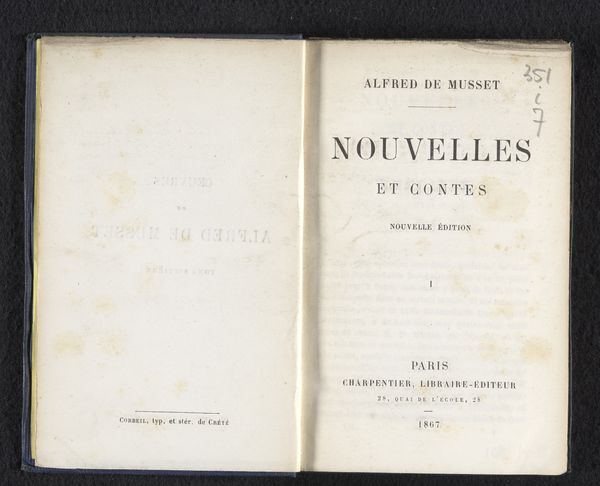
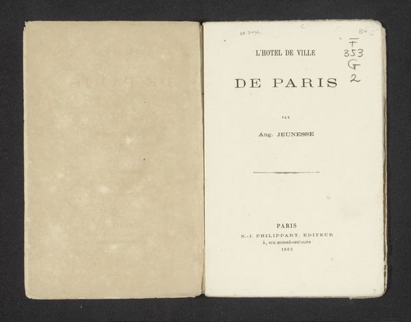
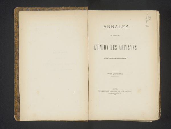
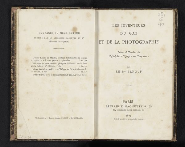
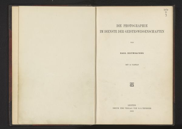
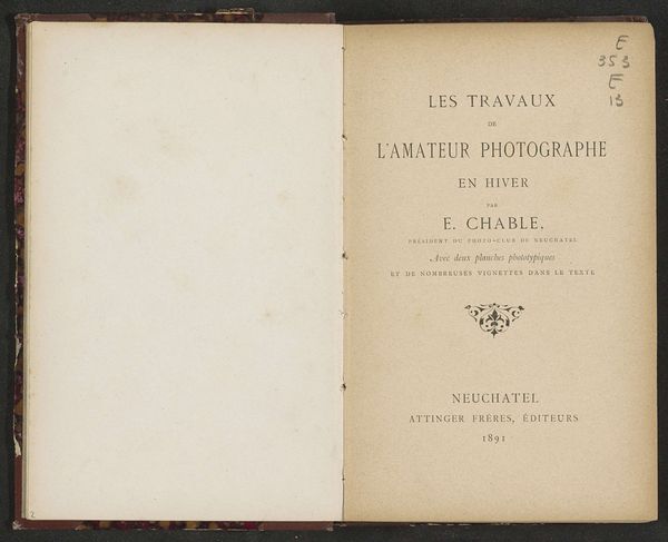
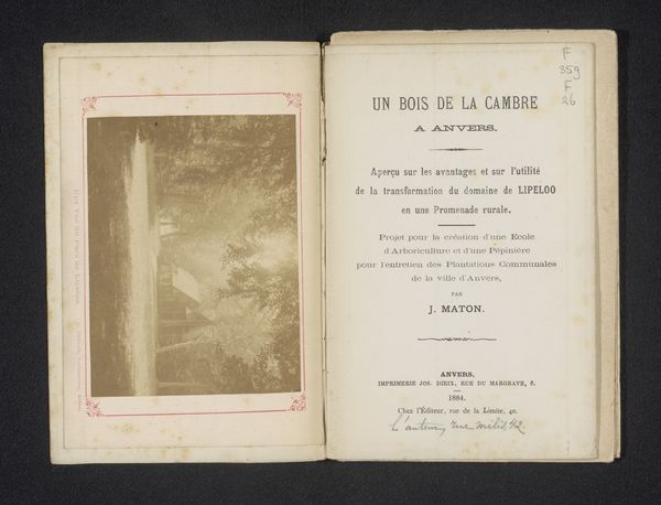
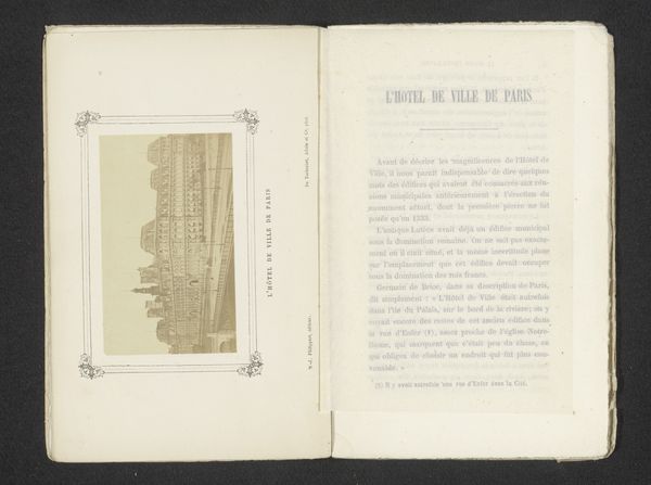
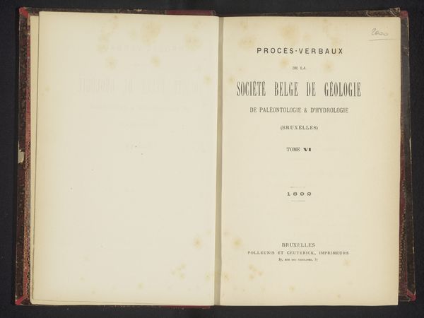
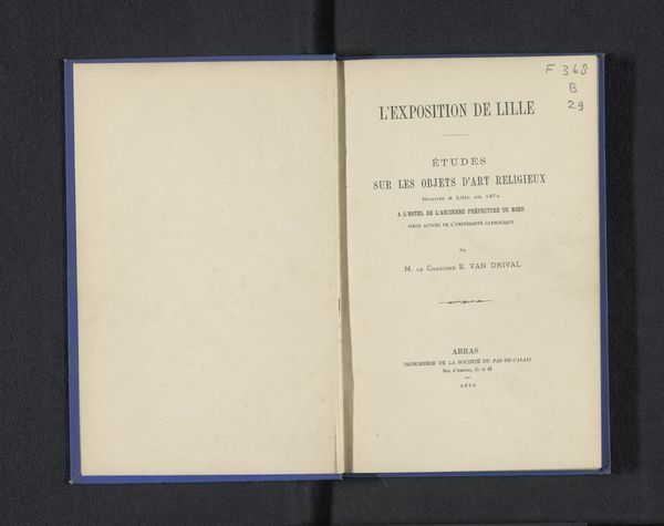
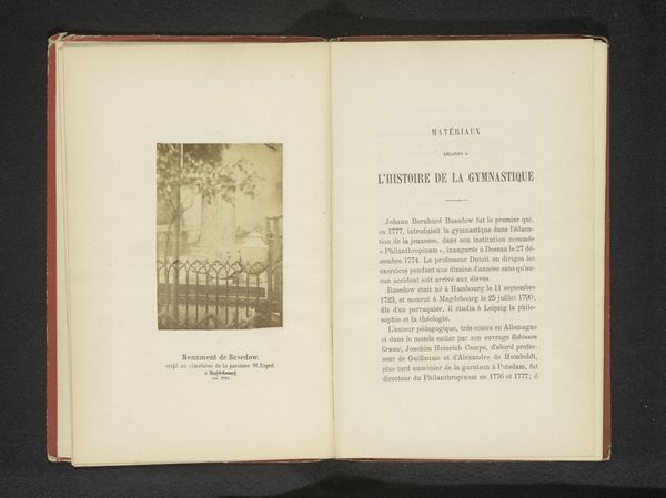
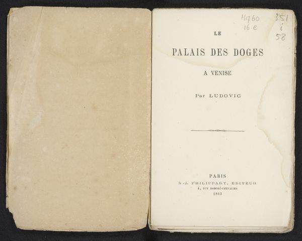
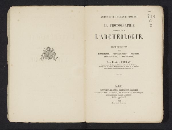
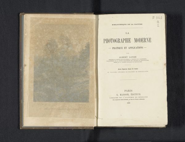
Curator: A minimalist cover! There is a delicate texture in the aged paper and the simple typography of the title. What do you make of it? Editor: The print we’re looking at is the title page of "En famille," a book by Charles Potvin, dating back to 1862. It offers us a glimpse into the domestic life and social values of that era through literature. The book format itself, produced by typography, has social implications—it allowed the mass circulation of ideas. Curator: Exactly. The cover emphasizes domestic life. Did this influence typographic design? Editor: Not obviously in the immediate design, although its unadorned title has its own understated formalism: the balance between the title "En Famille" and the author's name creates visual harmony, while the texture of the paper contributes to a sense of aged intimacy, pulling us into the world it represents. Curator: Right. Mass literacy was changing. Were texts and reading now becoming more of a group or solitary practice, shaping the very nature of the family unit? Editor: The formal elements – typography, paper – are the instruments, and Potvin as the orchestrator makes a world using the tools of 1862 to reach out to a literate population. It’s a potent cultural moment captured within those pages. The social impact and accessibility created a dialogue, quite literally in this instance, "En famille," of literature making it so those themes can spread. Curator: It is incredible to think how print, as an early mass medium, brought societal transformations, but could still embody an aesthetic intimacy. What strikes you the most now? Editor: Thinking of the texture, so evocative; it connects me to the intimate scale of domestic reading. Curator: Yes, the material whispers stories!
Comments
No comments
Be the first to comment and join the conversation on the ultimate creative platform.
