graphic-art, print, engraving, architecture
graphic-art
neoclacissism
16_19th-century
landscape
history-painting
engraving
architecture
Dimensions: height 416 mm, width 320 mm
Copyright: Rijks Museum: Open Domain
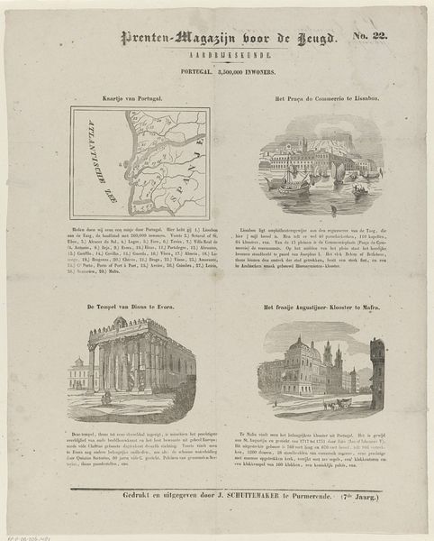
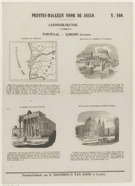
Curator: This is a print entitled "Portugal. - 3,500,000 Inwoners", dating back to 1850. It seems to be by Jan Schuitemaker. The piece combines a map, architectural renderings, and text. Editor: Immediately, the layout gives the impression of a well-ordered, albeit slightly crowded, geography lesson. I see architectural forms – idealized temples and cityscapes, rendered with fine detail. The sharp contrast in the engraving emphasizes permanence and history. Curator: It’s a fascinating glimpse into how nations presented themselves in print at that time. The graphic arts provided visual propaganda to cultivate a sense of national pride, wouldn’t you agree? It combines geographical awareness with monuments of power and cultural achievement. Editor: Indeed, note the engraving itself – this medium speaks to mass production and dissemination. Each line is deliberate, creating reproducible images on a substantial scale, and affordable to many. Consider also the social context – where and how would such a print have been consumed? Curator: These Neoclassical structures chosen for depiction also point to specific values of the time. Look at the Temple of Diana – it reflects back to the roots of classicism and ideas of an idealized past of Western Culture. What did that symbolism represent to people at the time this was created? Editor: Absolutely. Moreover, I find it interesting how the means of representation contribute to that idealization. Engraving allowed for a meticulous level of detail, almost a celebration of precise technical skill which is a core ideology that was embraced during industrialization in many ways. The choice of subject reinforces an intended feeling and impact. Curator: That precision mirrors an ambition towards systematized knowledge, aligning neatly with the emerging disciplines of geography and history in education. Each element works to impart a certain…grandeur to Portugal, don’t you think? Editor: Agreed. Considering the materiality and production behind it deepens the visual impact that continues today. It speaks to specific processes during 19th century print production, reaching many potential consumers. Curator: Yes. Looking at it now, the combination of text and image feels almost proto-infographic in some ways! This format creates layers that shape historical narrative through carefully selected symbols and representations of power. Editor: Definitely food for thought about image making and how prints impacted the consumption of information in Europe.
Comments
No comments
Be the first to comment and join the conversation on the ultimate creative platform.