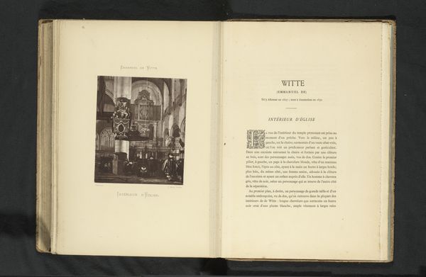
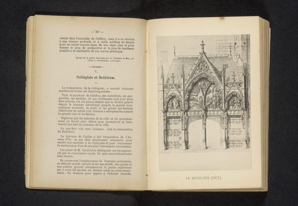
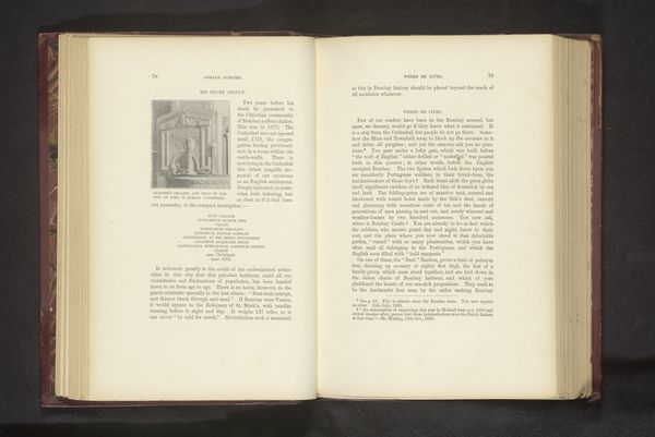
Histoire de Saint Augustin : évêque D'Hippone et docteur de l'église : d'après ses écrits et l'édition des Bénédictins / par une chanoinesse régulière de l'Ordre de Saint Augustin 1886
0:00
0:00
#
aged paper
#
homemade paper
#
script typography
#
paperlike
# print
#
hand drawn type
#
personal sketchbook
#
hand-drawn typeface
#
thick font
#
history-painting
#
delicate typography
#
academic-art
#
historical font
Dimensions: height 240 mm, width 150 mm, thickness 23 mm
Copyright: Rijks Museum: Open Domain
Editor: This is the title page and frontispiece from "Histoire de Saint Augustin," published in 1886 by Société Belge de Librairie. It features a print of a church alongside decorative typography. It’s got a really classic feel – how would you approach discussing this? Curator: I'd start with the paper itself. Notice the texture, the visible fibers. This speaks to a particular method of production, a deliberate choice of materials that connects to ideas of value and craft. How does the "homemade" aspect, if you will, challenge assumptions about mass production? Editor: I hadn’t thought of it like that. It's a commercial publication though, so it was made on a fairly large scale. Curator: Exactly. The seeming contradiction raises interesting questions about labor. Who was involved in creating this paper, and what was their status? We also should consider the "script typography" and "hand-drawn typeface," especially in relation to the history it aims to portray. Editor: You’re right. It's interesting to think about how that choice of font and page design reinforces the historical feeling of the book itself, almost as if it were from that time period. Curator: Precisely. What does this say about the consumption of history? The publishers were trying to create a tangible link to Saint Augustine's era through the book’s materiality. Editor: That’s fascinating. I came in thinking about the image, but you've made me think about all the layers of production embedded in the object itself. I will remember that approach for future artwork. Curator: Focusing on process allows us to unpack social and cultural meanings, revealing more than just the depicted subject. It will always offer an insightful understanding of art history.
Comments
No comments
Be the first to comment and join the conversation on the ultimate creative platform.
More like this