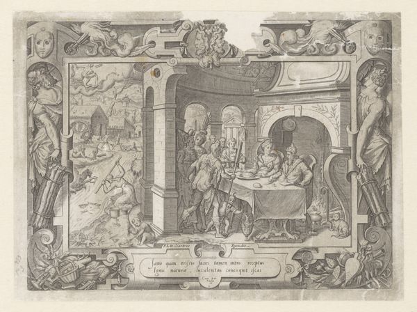
Titelprent voor de serie van de begrafenisstoet van Willem van Oranje, blad 1 1584 - 1638
0:00
0:00
hendrickgoltzius
Rijksmuseum
print, engraving
#
baroque
# print
#
pen sketch
#
old engraving style
#
history-painting
#
engraving
Dimensions: height 158 mm, width 360 mm
Copyright: Rijks Museum: Open Domain
Editor: This engraving, “Titelprent voor de serie van de begrafenisstoet van Willem van Oranje, blad 1” created between 1584 and 1638, by Hendrick Goltzius, is a striking Baroque piece. The crisp lines create a stark, formal atmosphere. What formal elements stand out to you in this work? Curator: The immediate appeal lies in its bifurcated composition: the stark textual block balanced against the architectonic rendering of space. Note the engraver’s command of line to articulate volume and depth within the implied architecture on the left. Editor: Yes, there's almost a photographic realism to the left. The detail is just incredible. Could you speak more about the interplay between the textual and architectural spaces? Curator: The tension lies in the flatness of the text versus the illusionistic depth on the other side. The text, framed by ornamental flourishes, is a statement—rigid, controlled, informative. The architecture and interior space on the left present us with something else altogether. Consider how Goltzius creates space and perspective through line density. It suggests a hushed, ceremonial interior with classical arches. The engraving thus juxtaposes statement with space. Editor: That's a fascinating contrast, almost as if two separate realities are occupying the same plane. How does that contrast affect our perception? Curator: It destabilizes any singular reading. The work resists narrative closure, and the viewer’s eye vacillates between the explicit statement and the evocative interior, each undercutting the other. The formal arrangement demands a sustained interpretive effort. Editor: I see that now. I came in seeing a clear-cut commemorative engraving, but it's so much more intricate and self-aware. Curator: Exactly. What at first appears straightforward proves, through formal examination, to be conceptually intricate.
Comments
No comments
Be the first to comment and join the conversation on the ultimate creative platform.
More like this