Copyright: Robert Cottingham,Fair Use
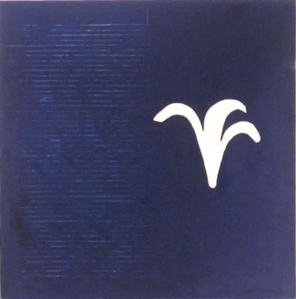
Robert Cottingham made this painting, Blues, sometime in the 20th century. The way he's picked out the details of this sign, it's like he's saying, "Hey, look at this thing we usually just pass by." It's all about the way we see, or don't see, the everyday stuff around us. I love the texture he's created. The peeling paint, the rust – you can almost feel it. It's not just a pretty picture; it's got a history, a story to tell. Look at the way the blue is layered; it's not just one flat color. There's a depth to it, like looking into a pool. And those yellow letters popping out against the blue, that's just delicious. It reminds me of Ed Ruscha, another artist who loves to paint signs. But where Ruscha is cool and detached, Cottingham feels warmer, more human. He's not just showing us a sign; he's showing us a piece of life. It's like he's saying, "Even the most ordinary things can be beautiful if you really look at them."
Comments
No comments
Be the first to comment and join the conversation on the ultimate creative platform.
More like this