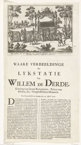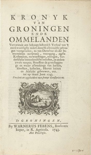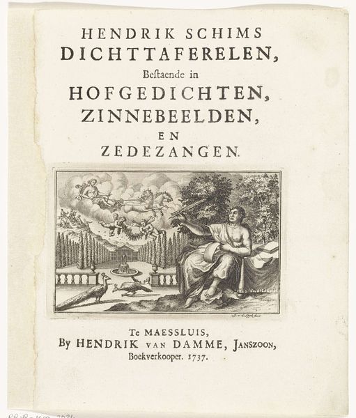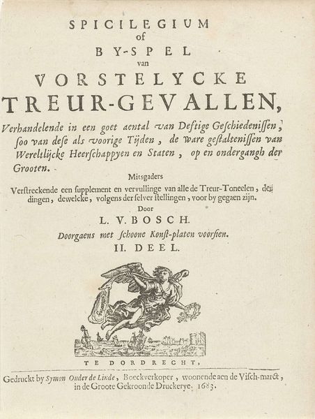
graphic-art, print, typography, engraving
#
graphic-art
#
aged paper
#
script typography
#
hand-lettering
#
baroque
# print
#
old engraving style
#
hand drawn type
#
personal sketchbook
#
typography
#
hand-drawn typeface
#
fading type
#
handwritten font
#
engraving
#
historical font
Dimensions: height 49 mm, width 75 mm, height 190 mm, width 116 mm
Copyright: Rijks Museum: Open Domain
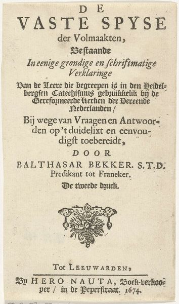
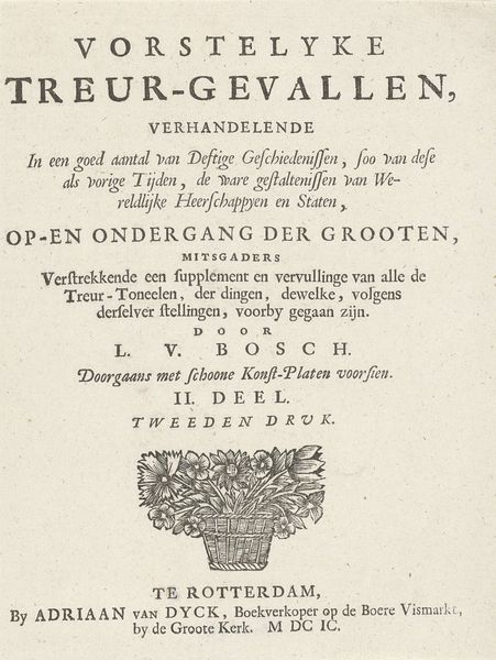
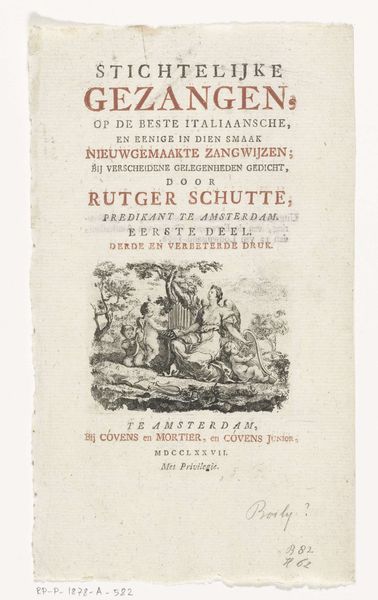
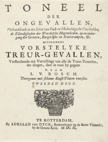
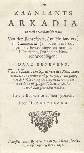
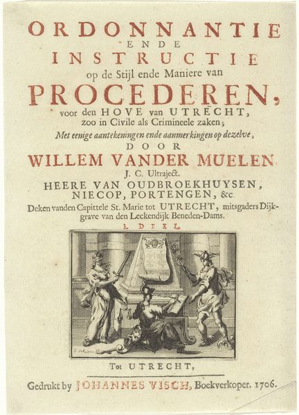
Curator: The piece is a 1753 engraving titled "Riviergod en een putto met boeken" (River God and a Putto with Books) by Monogrammist VD. It looks like it could have been a book cover of some kind. There's an aged quality to the paper and the typography is so precise. It's beautiful, but what do you make of it? Editor: The figure of the river god feels very classical, while the putto is pointing to a shield. Do you think the shield could represent the city? And the god is there for a river. What would you focus on if interpreting its imagery? Curator: I see that, yes. And considering its time, there's likely more going on here. River gods often embody the character and prosperity of a place, so tying him to architectural knowledge – *bouwkunde* – through the putto… Do you see how this suggests civic pride, and links local identity to reason and progress? Notice that there is an attempt to improve on what mistakes happened in the past in architectural knowledge. Editor: I hadn’t thought of it like that. So the image is about linking Rotterdam to wisdom and improvement, as the text reinforces the same goal of betterment. It is definitely Baroque in that respect, wanting to persuade with every detail. It seems more complex the more I look. Curator: Precisely! Even the "koperen platen" – copper plates – mentioned below Willem de Jong’s name, signify not just a technique, but a commitment to accuracy and quality, which ties into this drive to achieve *zuivere waarheid* - pure truth. That’s an aspirational statement of artistic and civic value. Editor: Looking closely reveals so much about cultural priorities beyond just the artistic technique. Curator: Agreed. It’s like uncovering a hidden language of symbols and values, isn’t it? This has made me realize it is a way of seeing Rotterdam. Editor: Exactly! It all becomes much richer! Thanks!
Comments
No comments
Be the first to comment and join the conversation on the ultimate creative platform.
