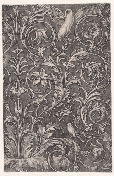
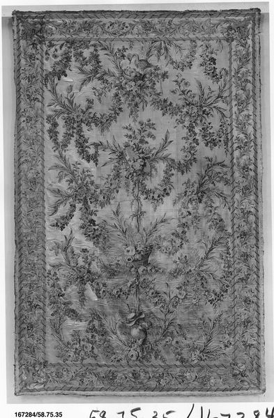
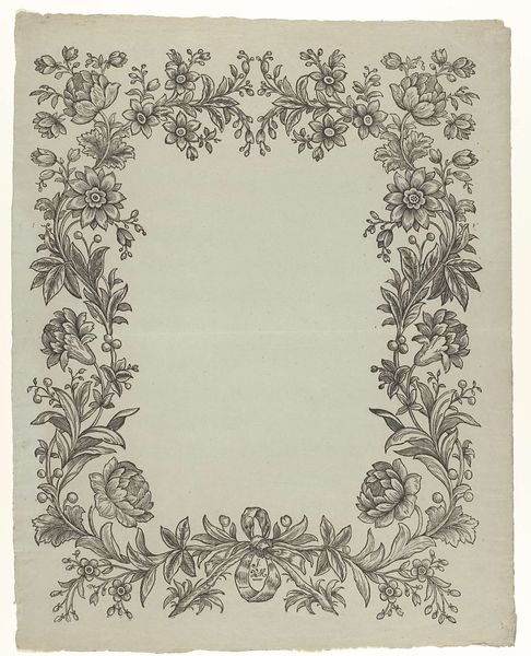
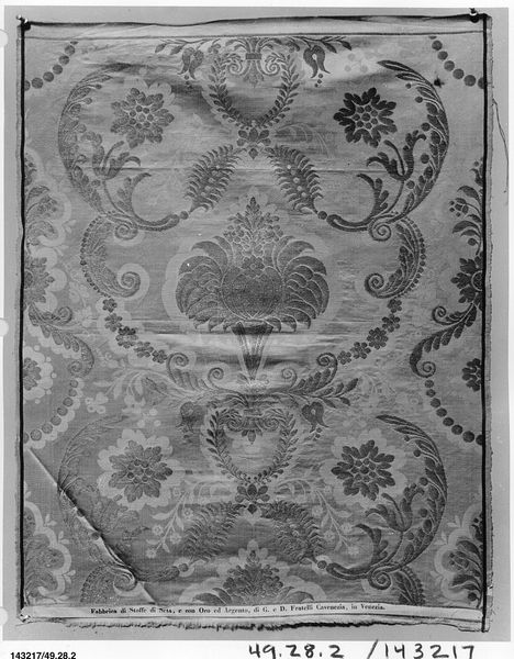
drawing, mixed-media, textile
#
drawing
#
mixed-media
#
muted colour palette
#
pattern
#
textile
#
fabric design
#
decorative-art
#
imprinted textile
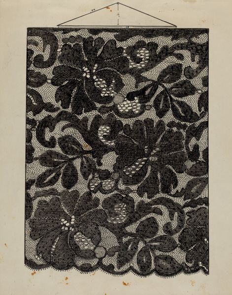
Dimensions: overall: 25.7 x 22.3 cm (10 1/8 x 8 3/4 in.)
Copyright: National Gallery of Art: CC0 1.0
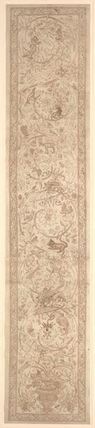
Curator: First impressions? I find it incredibly muted and almost ghostly. Editor: Agreed. There's a certain faded elegance to it. Before us, we have a piece entitled “Printed Cotton,” dating back to around 1936, conceived as a textile—probably through drawing and mixed media. Curator: Textile design, right. Immediately I feel the hands that touched it, or the clothes it might have adorned. It's funny how fabrics do that, carry ghosts. It makes me think of old love letters hidden in a jacket pocket, secrets whispered into silk linings. The patterns, like faded memories of blooming roses, give such an ethereal mood. Editor: That makes me think of how patterned textiles in this era often reflected social aspirations of access to bourgeois life. These decorative designs would be mass-produced and consumed by a new class of consumers—accessibly bringing aesthetic value to ordinary lives through printed textiles and empowering people with new forms of expressing identity through fashion. Curator: Identity through cloth…that resonates deeply. I’ve often felt that what we wear isn’t just about covering ourselves, but about projecting some hidden, cherished piece of ourselves outward, a message without words. Editor: Exactly. And while floral patterns like this might seem simple or purely decorative, they’re often deeply coded with meaning about the domestic space, and about femininity, which obviously changed across historical moments depending on race and class positions. Who had access to these textiles? Who did the work of making them, in what conditions, and where? What did “home” and "femininity" mean to different social groups? This invites critical thinking and contextualizing, because the way these flowers are presented isn’t "neutral". Curator: Of course. What’s on display is an artist’s rendering of how to imprint that ideal onto the very fabric of our lives—in essence, giving an ordinary person a shot at elegance. I am going to try and create a new image based on these old themes to feel that process from today's place in the world! It feels like breathing new life into a lost melody. Editor: It makes you wonder about the revolutions happening even within quiet design. That ability for accessibility and reinvention—those have ripple effects. Thinking through all the connections across class and race adds a depth of meaning to those once-ghostly roses.
Comments
No comments
Be the first to comment and join the conversation on the ultimate creative platform.
More like this