drawing, paper, pencil
#
drawing
#
light pencil work
#
pencil sketch
#
landscape
#
paper
#
pencil
#
cityscape
#
pencil work
#
realism
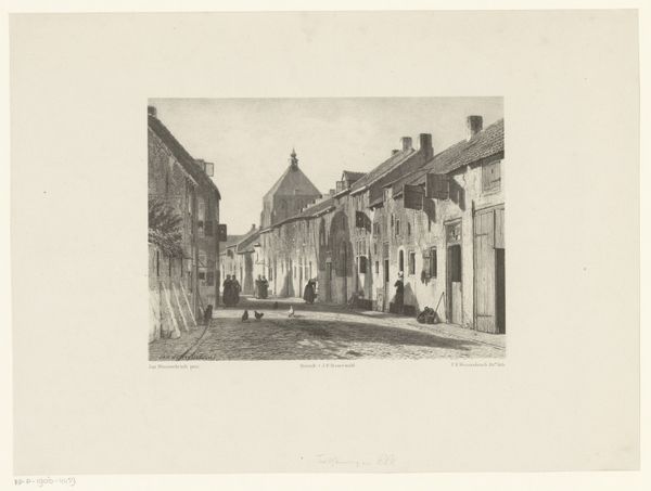
Dimensions: height 254 mm, width 201 mm
Copyright: Rijks Museum: Open Domain
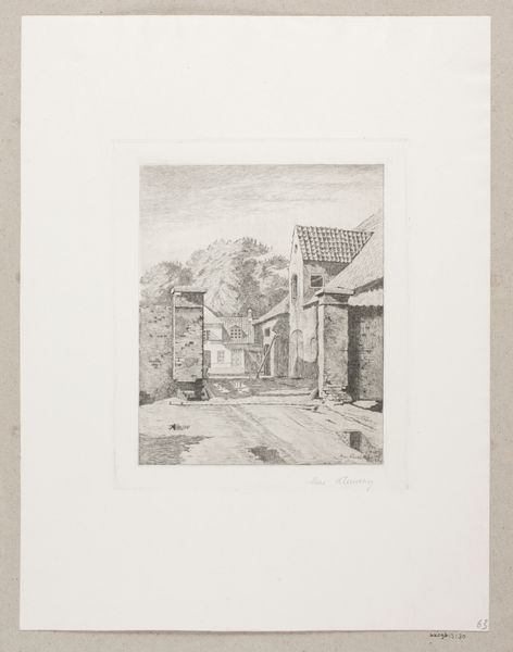
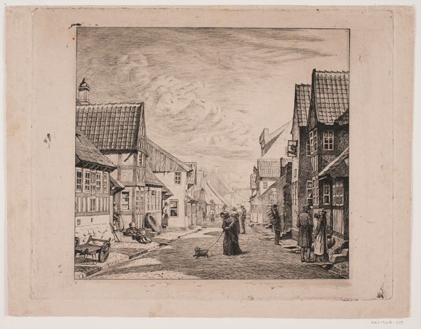
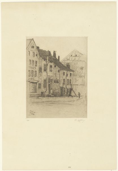
Editor: This is "Dorpstraatje met lage huisjes," a pencil drawing on paper, dating from sometime between 1796 and 1870, attributed to Bruno van Straaten. It's a rather charming street scene. What catches your eye, what's significant from a formalist perspective? Curator: The success of this work rests in its careful articulation of depth. Note how the artist establishes spatial recession not merely through linear perspective, but through modulating tonal values. Lighter areas suggest distance, while the darker, more intensely rendered foreground pulls the viewer into the scene. The strategic placement of the tree serves as a repoussoir, further enhancing the sense of three-dimensionality. Editor: The tree does anchor the composition nicely. So you're saying the interplay of light and dark, that's key here? Curator: Precisely. Consider how the artist uses the limited range of pencil tones to define form and texture. Look closely at the cobblestones, for example. Notice the variations in shading that suggest individual stones and the subtle irregularities of the street’s surface. It's not just a depiction; it's an investigation of texture through tonal variation. Also observe the relationship between line and shading in rendering the architectural details. Editor: It's interesting how much depth they achieve with so few tools. Is there a message in the fact it is unfinished? Curator: A valuable question. Indeed, what seems to be an “unfinished” aesthetic only furthers our insight into the formal aspects and construction. The sketch work highlights the artistic method of applying tone to the geometric volumes in play. Consider that buildings and walls are merely geometric constructions on display as method. The choice and mastery of these pencil strokes define the core and intended qualities of the finished work. Editor: I see. It makes you appreciate the craftsmanship involved. Curator: Exactly. And how effectively the artist used those basic elements to create an illusion of reality. It certainly gives food for thought about all of the design choices and intention in seemingly simple works.
Comments
No comments
Be the first to comment and join the conversation on the ultimate creative platform.
More like this