Copyright: CC0 1.0
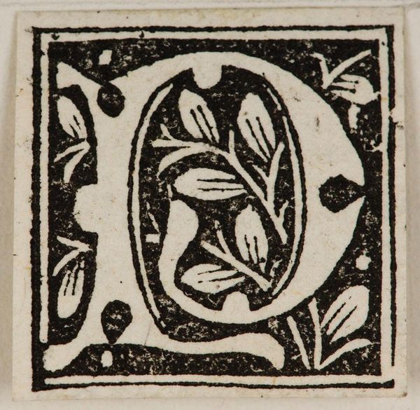
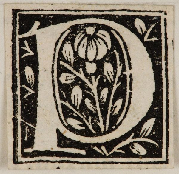
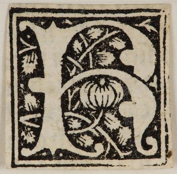
Editor: This is "Initial P" by an anonymous artist. It is a very neat woodcut of the letter P, decorated with foliage. What strikes you first about its design and composition? Curator: The stark contrast between the black ink and the white space immediately commands attention. The letterform itself is both structural and decorative, isn't it? How does the foliage interact with the P shape? Editor: It looks like the leaves fill the negative space inside the letter, giving the piece a sense of organic unity. Do you think that choice enhances the artwork's visual appeal? Curator: Yes, precisely. The interplay between the geometric and the organic elements creates a dynamic tension. This tension, coupled with the print's materiality, showcases a profound understanding of form and space, wouldn't you agree? Editor: I do! I now see how the artist balanced form and nature in such a small space. Curator: Indeed, and it speaks volumes about the power of simplification in art.
Comments
No comments
Be the first to comment and join the conversation on the ultimate creative platform.
More like this