drawing, paper, ink
#
portrait
#
drawing
#
paper
#
11_renaissance
#
ink
#
italian-renaissance
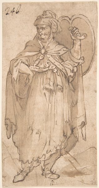
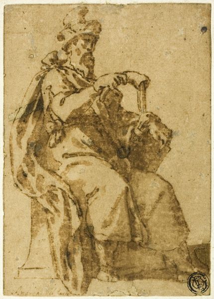
Dimensions: 417 mm (height) x 262 mm (width) (bladmaal)
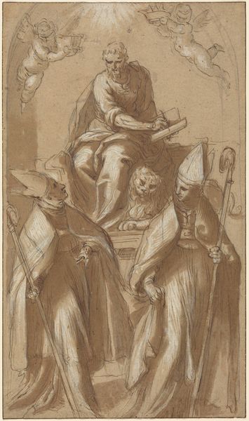
Editor: This is Giambattista Moroni’s drawing "Sankt Hieronymus og Sankt Augustin," created sometime between 1540 and 1578. It's an ink drawing on paper, and what immediately strikes me is the contrast between the sharply defined lines and the areas left almost blank. What stands out to you, looking at it purely from a formal perspective? Curator: Precisely. Disregarding representational aspects, let us examine the deployment of line. Note the dense, parallel hatching used to delineate form and shadow, a technique employed with remarkable precision, creating depth on a two-dimensional surface. Observe the artist's manipulation of line weight; thicker lines define the contours of the figures, lending them a palpable weightiness, while thinner lines suggest softer, more delicate textures, like the beard of the figure on the left. Do you perceive any imbalance or discordance in the composition itself? Editor: Well, the figure in the foreground, Saint Jerome I presume, is much more defined. Saint Augustine behind him almost seems like a ghostly afterthought, less detailed and fainter overall. Is that deliberate, perhaps a visual cue to their relative importance in the drawing or some comment on spatial depth? Curator: The hierarchy, certainly, is communicated through variation in finish, but before leaping to contextual interpretation, let's attend to the spatial implications. The contrast serves to flatten the image, causing some ambiguity. Is this recession truly achieved? It's an interesting conflict between line as definition and line as spatial indicator. Notice too, how little actual tonal modelling exists here; it's largely implied. Editor: I see what you mean! The starkness sort of pushes the figures forward despite the attempt to place one behind the other. So even without knowing the subject matter, we can glean so much about the artist’s process just by examining the lines themselves and how they relate to one another. Curator: Indeed, the power resides not in the ‘who’ or the ‘why,’ but in the ‘how’ – the execution. We perceive here a profound engagement with the possibilities inherent within the humble medium of ink on paper.
Comments
No comments
Be the first to comment and join the conversation on the ultimate creative platform.
More like this