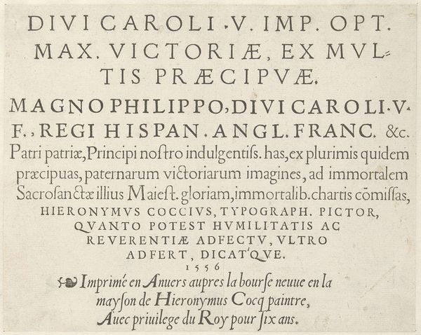
print, typography, engraving
#
hand-lettering
#
baroque
# print
#
old engraving style
#
hand drawn type
#
hand lettering
#
typography
#
hand-written
#
hand-drawn typeface
#
fading type
#
pen work
#
handwritten font
#
engraving
#
small lettering
Dimensions: height 148 mm, width 85 mm
Copyright: Rijks Museum: Open Domain
Curator: This is the title page for “Les vrais Principes de la Cavalerie,” or "The True Principles of Cavalry," created in 1749. It’s an engraving, designed as the frontispiece to G. Saunier's book on horsemanship. Editor: Immediately striking is the restrained elegance. The limited palette – primarily black ink with hints of red – imparts a sense of seriousness befitting its subject, yet the playful baroque details hint at the artistry within. Curator: I agree. The typographical hierarchy, moving from large, authoritative lettering to smaller, more descriptive text, clearly delineates the subject and the author. Observe how the capitalized words create a visual rhythm, guiding the eye downwards. The cherubic figures seem suspended within elaborate scrolling flourishes. Editor: The title itself underscores an interesting paradox, doesn't it? In a century of escalating social change and emerging individual expression, to proclaim 'true principles' suggests an aspiration for order and a nostalgic adherence to established structures, especially concerning aristocratic traditions such as horsemanship. What role did books like this serve? Were they primers, or nostalgic reminders of a lifestyle slipping away? Curator: Given the patronage of such books, they would've been relevant manuals indeed. We can observe from the delicate linework in the engraving – particularly the ornamental cartouche featuring those putti you mentioned – the printer aimed for refined tastes, indicative of an upper-class readership interested in maintaining appearances through masterful equitation. Semiotically, the arrangement points to clear visual signifiers – the angelic figures represent an idealized skill – juxtaposed above place of print "Amsterdam." Editor: Perhaps those very cherubic figures, perched delicately above Amsterdam, reveal more than just 'idealized skill'. They hint towards the intertwined relationship between military prowess, social status, and emerging commercial centres of the eighteenth century, no? Curator: Undoubtedly! Examining this work is a testament to the wealth of information embedded within a seemingly simple title page. It brings social history and close-reading in conversation. Editor: Indeed, moving beyond mere aesthetics, these engraved elements demonstrate that even in a seemingly formal and instructional image, there's so much depth for interpretation, revealing tensions in historical practice and social mobility.
Comments
No comments
Be the first to comment and join the conversation on the ultimate creative platform.
More like this