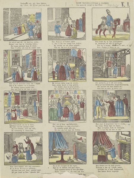
Verheugt u vrij, gij, lieve kleinen, / Op 't feest, dat gij zoo goed toch kent. / Sint Nicolaas komt u verschijnen, / Maar neen, de vreugd in deze prent 1822 - 1870
0:00
0:00
cclvanstaden
Rijksmuseum
lithograph, print
#
narrative-art
#
dutch-golden-age
#
lithograph
# print
#
folk-art
#
genre-painting
Dimensions: height 410 mm, width 334 mm
Copyright: Rijks Museum: Open Domain
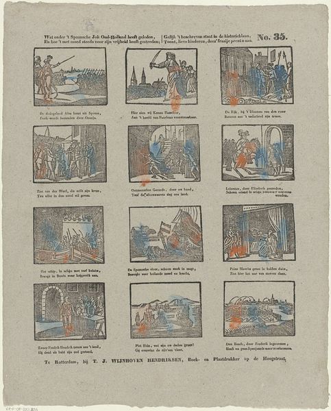
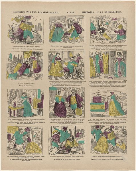
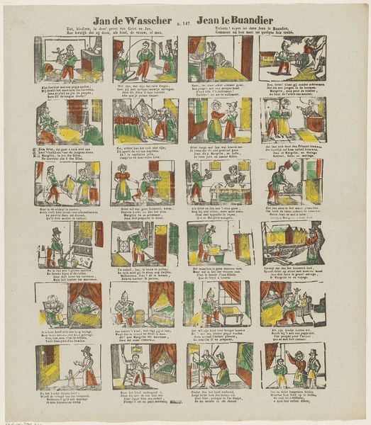
Editor: Here we have a lithograph entitled "Verheugt u vrij, gij, lieve kleinen…" created by C.C.L. van Staden between 1822 and 1870, held in the Rijksmuseum. It's comprised of twelve vignettes, and it feels very much like a comic strip, albeit a somewhat mysterious one. What catches your eye in terms of its composition? Curator: The linear quality, and particularly the consistent grid layout, immediately assert the artist's control. Van Staden delineates each scene with clarity, allowing for a sequential reading, yes, like a comic strip you observe. The limited colour palette further emphasizes the formal structure; it creates unity. Each individual segment contains rhyming stanzas beneath the visual, which gives the work textual symmetry that speaks to visual intent, do you agree? Editor: Yes, it creates harmony, like individual frames or building blocks, contributing to the structural integrity of the lithograph, where the story complements and supports its layout. But does the simple arrangement suggest any specific significance? Curator: The sequential and rhythmic patterns emphasize narrative progression, where color blocking and figure types become semiotic and contribute to the theme. It visually simulates the oral traditions of folk narratives and reflects the cultural context, particularly pertaining to oral traditions through the visual. Note the repetition of figures and spatial relations. Do you think these add to our structural knowledge? Editor: Definitely! The repetitive quality emphasizes its symbolic function; Saint Nicholas and his companions, houses, etc. and the sequential structure suggests storytelling and collective memory of Saint Nicholas! The print showcases formal language by giving space and context in Dutch to the narratives being depicted. Curator: Exactly. The symmetry within each compartment mirrors the anticipated rhythm of the Saint Nicholas narrative itself, thus reinforcing the conceptual framework. This reinforces my argument about formalism when depicting oral and visual literacy. Editor: Seeing how the piece repeats shapes, symbols, characters and stories, it comes across as quite compelling when contextualized this way! Curator: Agreed; analyzing Van Staden's formal construction helps dissect its deeper intent within cultural practices.
Comments
No comments
Be the first to comment and join the conversation on the ultimate creative platform.
More like this