Copyright: Gunther Forg,Fair Use
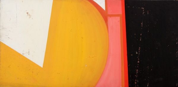
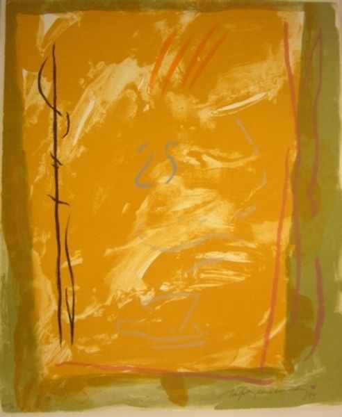
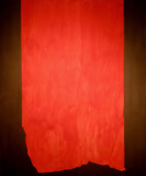
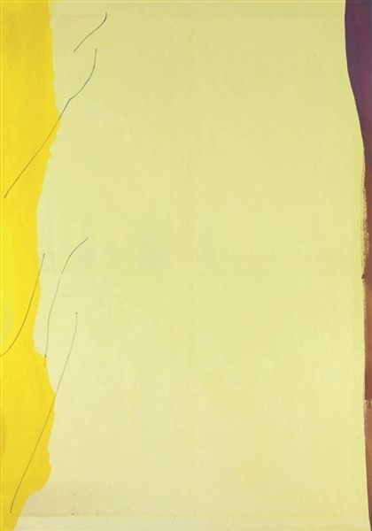
Editor: Here we have Gunther Forg's "Genter Serie" from 1998, made with acrylic paint. The large, blocky shapes of yellow and red are quite striking. The surface seems textured and brushed, yet overall it has a very cool, calm feel. How do you interpret this work, looking at its compositional elements? Curator: Immediately, the composition establishes a clear visual hierarchy. The central yellow rectangle, while perhaps not perfectly centered, commands attention by virtue of its size and its contrast against the flanking red vertical bars. The surface texture interests me, offering a tactile, handmade quality that tempers the rigid geometry. Do you see how this interplay of formal elements creates a dynamic tension? Editor: Yes, I see what you mean. The visible brushstrokes disrupt the pure minimalist aesthetic. The texture also creates depth; it's not just a flat plane of color. Curator: Precisely. Consider how Forg employs color. The yellow and red aren't blended but presented in distinct zones. It would be fruitful to analyze this through the lens of semiotics: what meaning arises from their juxtaposition, beyond just pure chromatic value? Editor: I hadn’t considered a semiotic approach. I was just enjoying the colours. So you’re saying the colors create a conversation? Curator: A discourse, if you will. Formalism grants that colors themselves possess inherent, culturally-imbued meanings that speak across linguistic and social divides, thereby triggering interpretation. In short, it isn't just a pretty painting but a calculated construction intended to elicit response via visual architecture. Editor: I see. Thinking about it structurally, it isn't just the colors themselves but also the placement of them. Thank you, that’s definitely expanded how I look at abstract art. Curator: My pleasure. Looking closely unlocks latent structures embedded within, offering fertile ground for contemplation.
Comments
No comments
Be the first to comment and join the conversation on the ultimate creative platform.
More like this