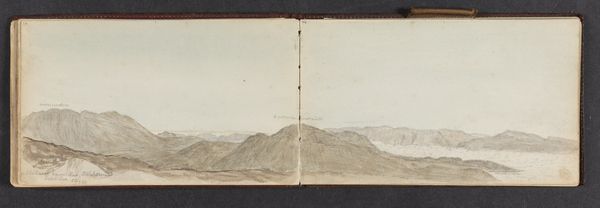
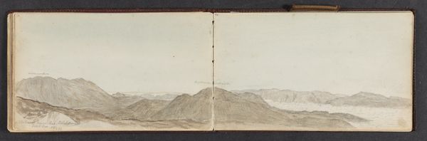
plein-air, paper, watercolor
#
plein-air
#
landscape
#
paper
#
watercolor
#
coloured pencil
#
watercolor
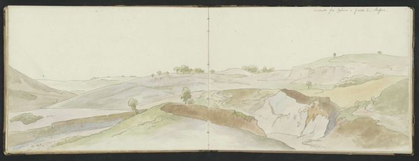
Dimensions: height 195 mm, width 465 mm
Copyright: Rijks Museum: Open Domain
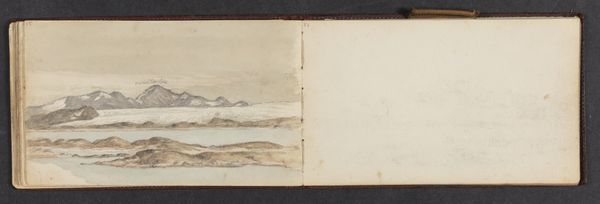
Editor: Here we have Jan Brandes' "Pad naar de Overberg aan de Caap" created in 1786 using watercolor on paper. What strikes me is how subdued the colours are, a muted palette that somehow conveys a sense of immense space and distance. How do you read this landscape? Curator: I am drawn to the carefully constructed composition. Note the tripartite division: sky, mountains, and plains. The clouds echo the mountain range, establishing a visual rhythm. How do you interpret the artist's handling of light and shadow? Editor: It seems like the light flattens the mountain, reducing depth. The limited shadows makes it almost like a backdrop. Do you think this was intentional? Curator: Precisely. This flattening is not a weakness but a choice. Brandes appears less interested in mimetic representation and more in presenting a schematic, almost diagrammatic, version of the landscape. Consider how the winding path directs the viewer's gaze into the composition. Does this not seem to reinforce the artifice? Editor: It does, actually. I initially saw the lack of dramatic shading as a failing but now it reads more like a deliberate compositional choice, an element that guides the eye. I appreciate how the colour palette gives a subdued rendering to the landscape. Curator: And through this carefully controlled palette and composition, Brandes achieves a captivating image that transcends mere representation. Editor: It's fascinating how focusing on those intrinsic pictorial qualities—color, composition, light—reveals a whole new layer of intent. Curator: Indeed, a close visual analysis offers the richest understanding.
Comments
No comments
Be the first to comment and join the conversation on the ultimate creative platform.
More like this