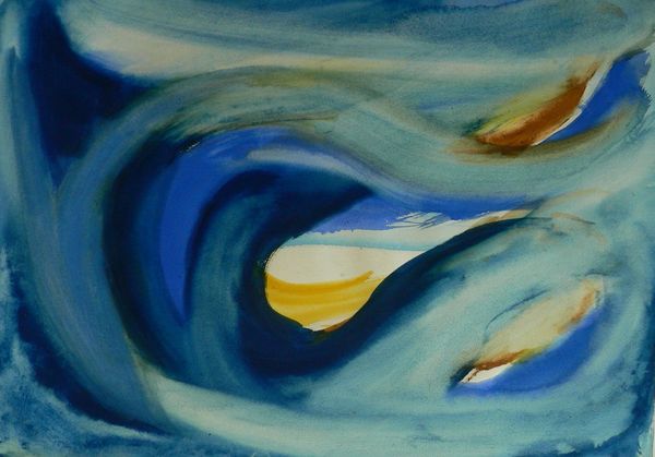
Copyright: Lawren Harris,Fair Use
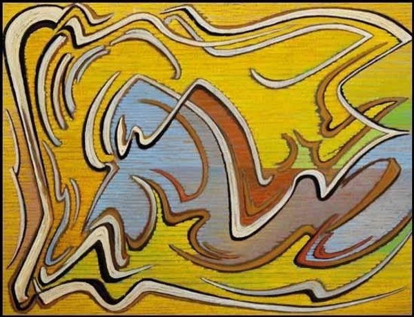
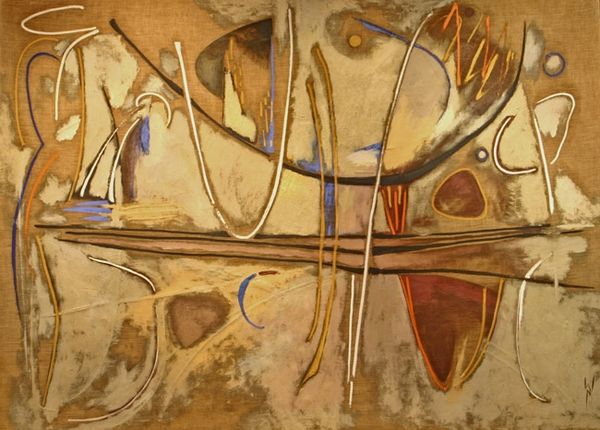
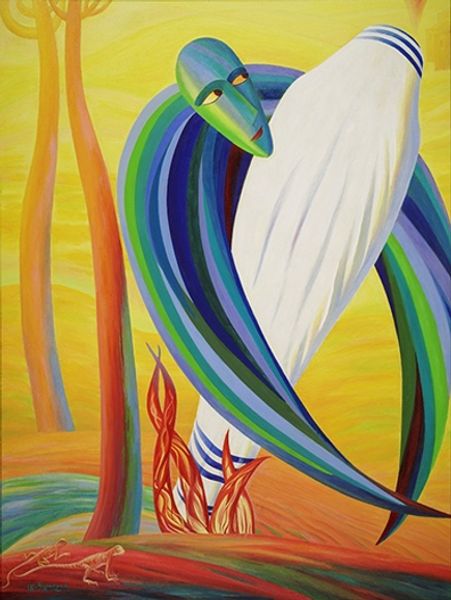
Editor: Here we have Lawren Harris's "Abstraction 30," created in 1955 using oil paint. I am really intrigued by the blending of colours, it looks quite Fauvist to me, with all the yellows, blues and greens, and how they work to create almost geometric forms. How would you interpret this artwork? Curator: Focusing solely on its internal structure, the painting exhibits a fascinating tension. Notice the interplay between curvilinear and rectilinear forms. The flowing lines in the foreground contrast sharply with the more defined shapes above, creating a sense of visual dynamism. Editor: That's interesting. So you're less concerned with what Harris *meant* to depict and more about the shapes themselves? Curator: Precisely. Observe the use of colour. The predominantly yellow palette, punctuated by blues and greens, creates a harmonious whole, yet the tonal variations within each colour contribute to a sense of depth. Could we analyze the geometric planes within that larger curve in the foreground? How do you see these structural relations working? Editor: I hadn't thought about it that way before, but it’s all in the relations within that larger segment and how it works to propel our understanding of foregrounded vs backgrounded images. Curator: It's about how the formal elements—line, colour, shape, texture, composition—function and create the artwork's internal logic, and in turn what constitutes an appeal to the viewer. The materiality of the oil paint, the very texture, and stroke, are all part of the analysis. What a stunning engagement with the inherent possibilities of abstraction. Editor: I can see how focusing on those elements brings a different appreciation to this work. Thanks, that was fascinating! Curator: My pleasure.
Comments
No comments
Be the first to comment and join the conversation on the ultimate creative platform.
More like this