graphic-art, print, paper
graphic-art
comic strip sketch
narrative-art
comic strip
paper
comic
genre-painting
Dimensions: height 400 mm, width 268 mm
Copyright: Rijks Museum: Open Domain
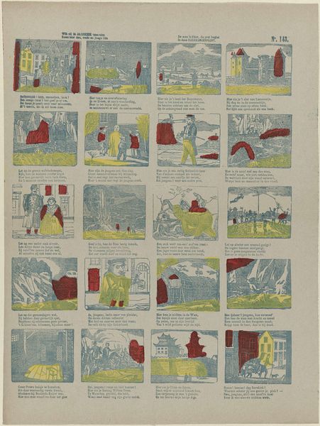
This color lithograph print, "Zooals papa / Verbeterde spreekwoorden", was made by Gordinne. It’s like a little comic strip, full of quirky scenes and figures. What grabs me first is the color. It’s not trying to be realistic, more like a memory of color. The artist uses a limited palette, almost pastel-like, that feels both playful and a bit nostalgic. It’s as though Gordinne is less interested in the precision of representation and more in the rhythm of the story unfolding. Take the panel of the man falling into water. The way the lines are etched, you can almost feel the splash. The artist isn't precious about hiding the process; it’s all there for you to see. It reminds me a bit of George Grosz, but with a softer edge. Both artists use a similar approach to line and composition, but Gordinne brings a lightness that sets it apart. Art like this reminds us that there’s more than one way to see the world, and it’s in the artist’s hand to show us those possibilities.
Comments
No comments
Be the first to comment and join the conversation on the ultimate creative platform.