drawing, mixed-media, paper, ink, pen
#
drawing
#
mixed-media
#
ink paper printed
#
old engraving style
#
hand drawn type
#
paper
#
personal sketchbook
#
ink
#
hand-drawn typeface
#
ink drawing experimentation
#
pen-ink sketch
#
ink colored
#
pen work
#
sketchbook drawing
#
pen
Copyright: Rijks Museum: Open Domain
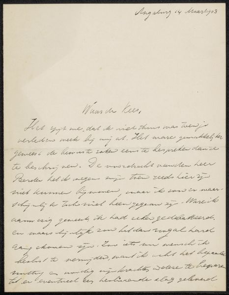
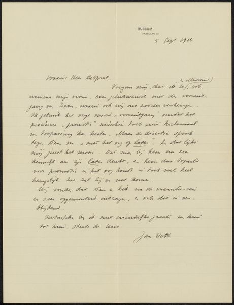
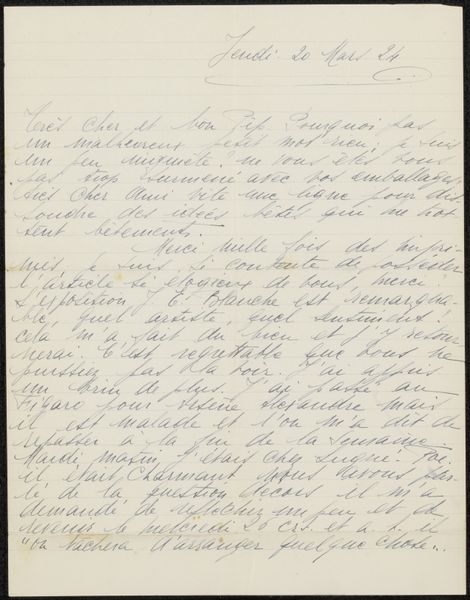
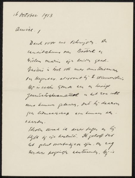
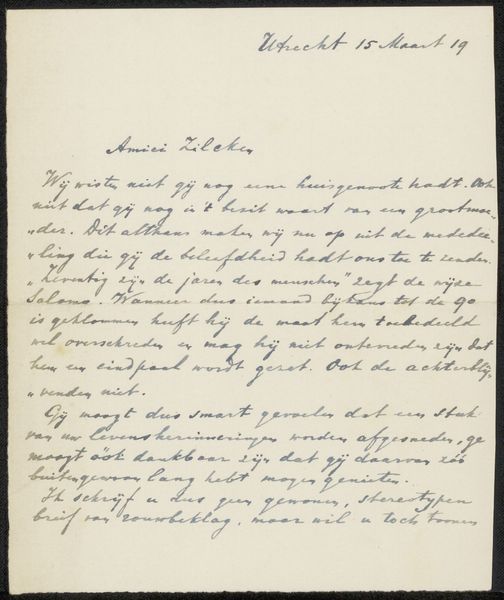
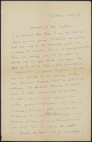
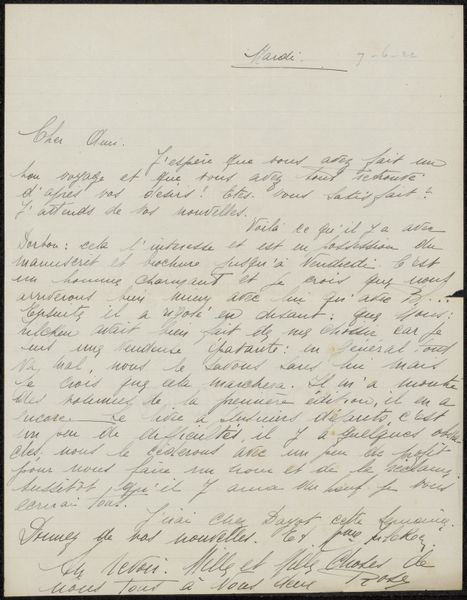
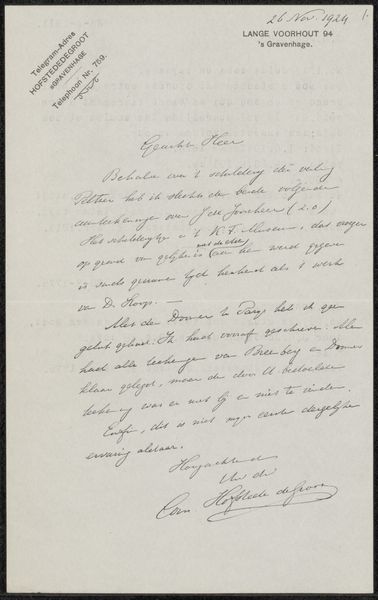
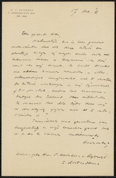
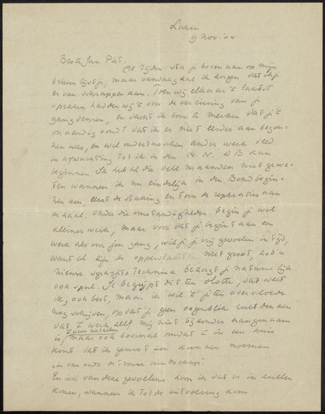
Curator: This drawing, "Brief aan August Allebé," possibly created in 1911 by Frans Coenen, incorporates pen, ink, and other media on paper. Its dense inscription immediately captures my attention. Editor: Yes, there’s an intensity to it. The hand-drawn typeface, almost a controlled scribble, gives it a chaotic, energetic feel. What was Coenen aiming to achieve with such frantic mark-making? Curator: The social and material context suggests this isn't just playful energy. It appears to be a personal letter. Examining the work through this lens emphasizes the labor of correspondence, of transmitting thought into physical form. Notice the corrections and the dense, almost urgent script. Editor: The density is striking. Looking at it purely from a visual perspective, the dark ink against the aged paper creates a strong contrast, flattening the spatial depth. The letterform itself carries meaning, even before deciphering the text, wouldn't you say? Curator: Absolutely. And understanding Coenen's social standing as a writer helps decipher further clues, too. His role in the literary world and engagement with figures like Allebé illuminates the letter's possible political or artistic undercurrents. It invites us to contemplate who the intended recipient was. Editor: Agreed, understanding Allebé's reception of this 'product' as Coenen calls it would offer insights, but the way he carefully renders each word and abbreviation has me thinking of traditional calligraphy but in this incredibly accelerated fashion! The choice of material – humble pen and ink – allows for immediacy and authenticity. Curator: Precisely. The choice defies typical art world boundaries, almost more related to an ordinary person scribbling down to thoughts, concerns, that makes the drawing a compelling reminder of artistic networks, manual labour, and written production back in that period. Editor: It is hard to pull myself away from the surface. From this exercise of looking closer, I can see an exercise in expression itself; the raw and tactile quality creates an interesting juxtaposition, one you might find on personal sketchbooks, too.
Comments
No comments
Be the first to comment and join the conversation on the ultimate creative platform.
More like this