drawing, print, ink, engraving
#
drawing
#
dutch-golden-age
# print
#
landscape
#
ink
#
cityscape
#
engraving
Dimensions: height 80 mm, width 115 mm
Copyright: Rijks Museum: Open Domain
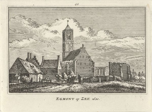
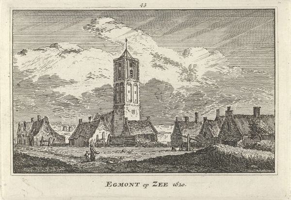
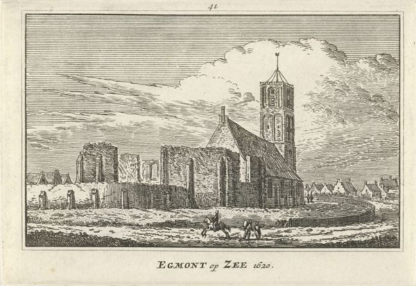
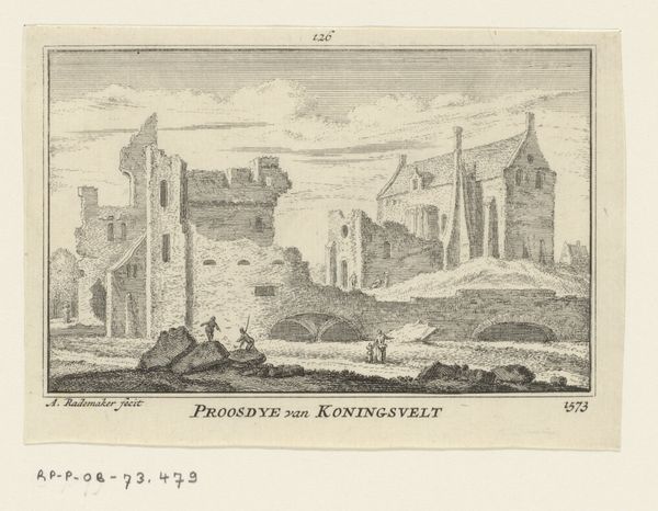
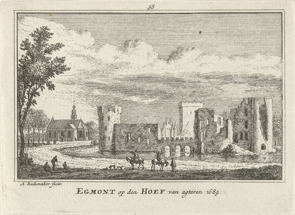
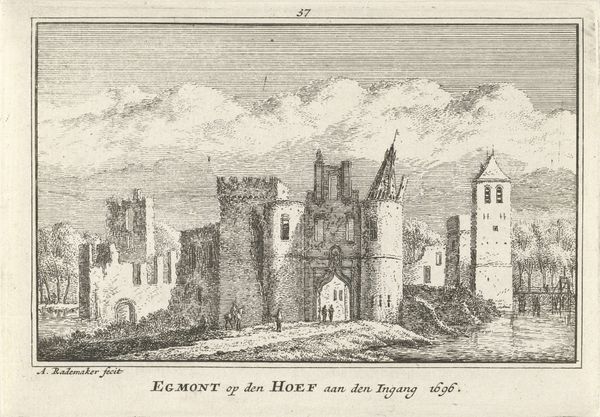
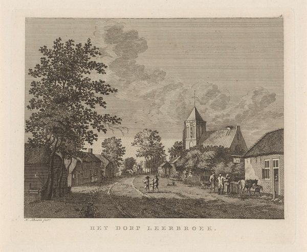
Editor: This engraving by Abraham Rademaker, titled "Gezicht op Egmond aan Zee, 1620," presents a fascinating cityscape. I'm struck by the starkness of the lines and how the artist uses them to create depth and texture. What stands out to you most in terms of its formal qualities? Curator: The artist's use of line is indeed compelling. Notice how the horizontal lines in the sky contrast with the verticality of the church tower and the diagonals of the rooftops. The texture is achieved through varied densities of hatching and cross-hatching, creating a nuanced play of light and shadow. The formal arrangement invites close inspection. Consider how the church is set to the top left but then our eyes are drawn down to the detail and then over to the town with the figures. Do you see this, too? Editor: I do! And it almost feels unbalanced, yet my eyes keep moving around the whole piece. I also notice the subtle contrast between the geometric architecture and the more organic rendering of the clouds and foliage. Curator: Precisely. This contrast serves to animate the composition. What do you observe about the orthogonals or any breakdown in spatial integrity? Editor: The orthogonals aren't perfectly aligned and create a certain unease - making you question what you are seeing in this image. Are they further pushing on spatial representation or creating depth, and where in the piece is this most clear? Curator: They do this with a clear intention that disrupts a Renaissance viewpoint perspective. What can be gathered through close inspection, as we’ve performed? Editor: I appreciate how focusing on these elements elevates my understanding beyond just the depiction of a city; I'm starting to see how Rademaker used form and technique to evoke a specific mood. Curator: Precisely. The value lies not just in recognition, but in deciphering the intrinsic artistic language employed. This focused assessment unveils layers that might otherwise remain unnoticed.
Comments
No comments
Be the first to comment and join the conversation on the ultimate creative platform.
More like this