About this artwork
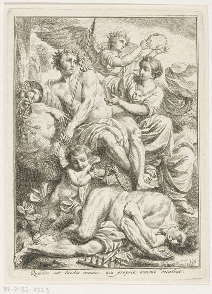
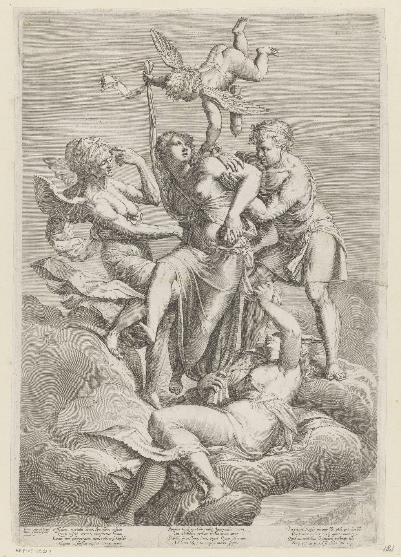
Curator: Welcome. Before us hangs a fascinating print from between 1575 and 1600, currently attributed to an anonymous artist. It is titled “Virtue Protected by Love against Ignorance, Misunderstanding and False Conviction." Editor: It's rather chaotic at first glance, isn't it? Figures swirling against a cloud-like backdrop. A dramatic, almost theatrical presentation with that airborne figure wielding something like a fiery…device? The detail given how limited the contrast is quite something. Curator: Yes, the composition adheres to a Mannerist aesthetic, doesn't it? Note the artificiality, the elongated forms, and the compression of space. It really plays into the allegorical nature of the image, focusing on symbolism. Editor: From a material perspective, though, one wonders about the actual production of such detailed lines. The plate would need meticulous preparation and the quality of the ink, and paper would vastly affect the result. I am curious about the culture of printmaking at this time, about workshops of craftspeople making multiples and the exchange between artists. Curator: An excellent point! The multiplication of images through prints really democratizes viewership, spreading visual rhetoric much farther. And those rhetorical aspects are critical here: Love protects Virtue, clearly, fending off the threats that plague true understanding. Observe the expressions, how they denote specific states of mind. Editor: But there's a sense of laboriousness, isn't there? A density of mark-making and the lack of depth produces this feeling of constrained materiality. Perhaps speaking to an anxiety about artmaking, itself. Are we seeing a physical struggle for production, as well? Curator: Perhaps! A persuasive reading. But returning to the form, note how even in the seeming chaos, there is balance. The upper and lower figures anchor the dynamism in the middle. This is a very controlled form, using visual dynamism to portray… Editor: A certain tension, that feels quite contemporary, frankly. But viewing the textures makes one wish to know the types of inks available and what effects could be achieved. Perhaps also how the artist collaborated with paper makers to develop this visual landscape. Curator: Fascinating. In its complex interplay of allegorical and stylistic forms, it offers us insight into the late Renaissance. Editor: Agreed, it speaks volumes to art practices of the time and invites us to rethink materiality.
Deugd door Liefde beschermd tegen Onwetendheid, Misverstand en Verkeerde Overtuiging
1575 - 1600
Anonymous
@anonymousLocation
RijksmuseumArtwork details
- Medium
- print, engraving
- Dimensions
- height 422 mm, width 294 mm
- Location
- Rijksmuseum
- Copyright
- Rijks Museum: Open Domain
Tags
Comments
Share your thoughts
About this artwork
Curator: Welcome. Before us hangs a fascinating print from between 1575 and 1600, currently attributed to an anonymous artist. It is titled “Virtue Protected by Love against Ignorance, Misunderstanding and False Conviction." Editor: It's rather chaotic at first glance, isn't it? Figures swirling against a cloud-like backdrop. A dramatic, almost theatrical presentation with that airborne figure wielding something like a fiery…device? The detail given how limited the contrast is quite something. Curator: Yes, the composition adheres to a Mannerist aesthetic, doesn't it? Note the artificiality, the elongated forms, and the compression of space. It really plays into the allegorical nature of the image, focusing on symbolism. Editor: From a material perspective, though, one wonders about the actual production of such detailed lines. The plate would need meticulous preparation and the quality of the ink, and paper would vastly affect the result. I am curious about the culture of printmaking at this time, about workshops of craftspeople making multiples and the exchange between artists. Curator: An excellent point! The multiplication of images through prints really democratizes viewership, spreading visual rhetoric much farther. And those rhetorical aspects are critical here: Love protects Virtue, clearly, fending off the threats that plague true understanding. Observe the expressions, how they denote specific states of mind. Editor: But there's a sense of laboriousness, isn't there? A density of mark-making and the lack of depth produces this feeling of constrained materiality. Perhaps speaking to an anxiety about artmaking, itself. Are we seeing a physical struggle for production, as well? Curator: Perhaps! A persuasive reading. But returning to the form, note how even in the seeming chaos, there is balance. The upper and lower figures anchor the dynamism in the middle. This is a very controlled form, using visual dynamism to portray… Editor: A certain tension, that feels quite contemporary, frankly. But viewing the textures makes one wish to know the types of inks available and what effects could be achieved. Perhaps also how the artist collaborated with paper makers to develop this visual landscape. Curator: Fascinating. In its complex interplay of allegorical and stylistic forms, it offers us insight into the late Renaissance. Editor: Agreed, it speaks volumes to art practices of the time and invites us to rethink materiality.
Comments
Share your thoughts