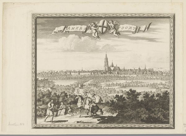
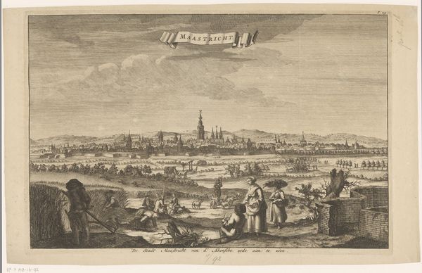
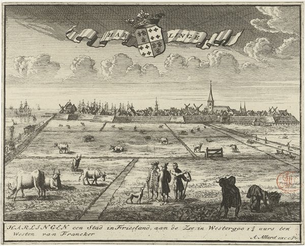
drawing, print, engraving
drawing
baroque
dutch-golden-age
landscape
horse
cityscape
engraving
Dimensions: height 167 mm, width 200 mm
Copyright: Rijks Museum: Open Domain
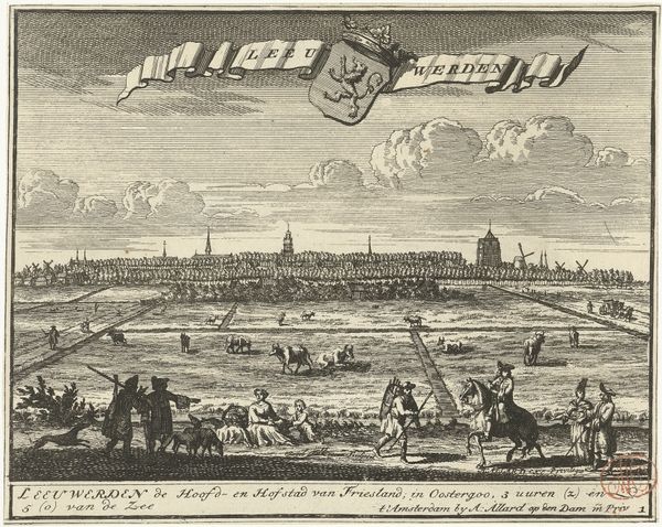
Editor: Here we have Jacob Folkema's "Gezicht op Bolsward," a Dutch Golden Age engraving likely made sometime between 1702 and 1767. It presents a broad view of the town. The lines are so intricate. I’m struck by how the artist organized the composition, from the figures in the foreground to the distant skyline. What are your initial observations, looking purely at its formal elements? Curator: Indeed, note how Folkema employed a rigorous structure, dividing the image plane into distinct horizontal bands. The foreground's populated activity contrasts sharply with the middle ground's pastoral expanse and the skyline. What does this layered structure communicate to you? Editor: Well, the layering creates a sense of depth. But I'm also thinking about how the sharp lines defining the figures soften into the blurry rendering of the town itself. It's almost as if detail diminishes with distance. Curator: Precisely. It is the contrasting textures achieved through line work that commands attention. Consider also how the cartouche at the top mirrors and balances the inscription below. Do you see this repetition functioning structurally? Editor: Yes, now that you mention it! The lettering and heraldry visually bracket the scene, creating a sort of self-contained world within the frame. But it also makes me wonder if that banner competes with the main image? Curator: The placement of these elements directs the viewer's eye strategically, preventing a void and integrating text within the pictorial space, enriching the experience. Also, observe the variation in the application of hatching and cross-hatching. How does that tonality impact your interpretation? Editor: I see how that is distributed now - heavier in the foreground, sparser towards the horizon, further enhancing that sense of depth through contrasting tones. That is fascinating! Curator: Agreed. Ultimately, it's through analyzing these compositional strategies that we access meaning. It exemplifies a mastery of engraving techniques during the Dutch Golden Age, achieving pictorial depth and structural unity. Editor: This deep dive has really highlighted the relationship between technique and the creation of spatial depth. I appreciate how a focus on line and composition really unlocks a richer understanding of the work.
Comments
No comments
Be the first to comment and join the conversation on the ultimate creative platform.