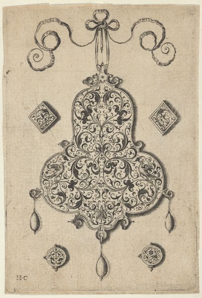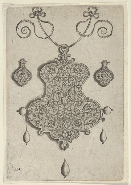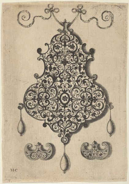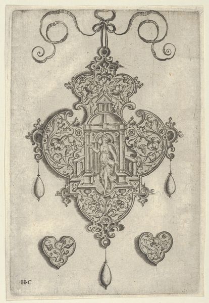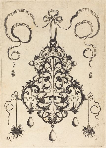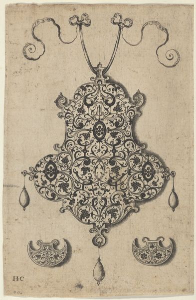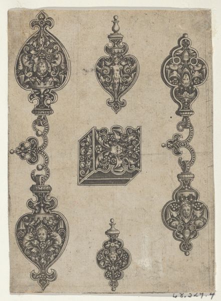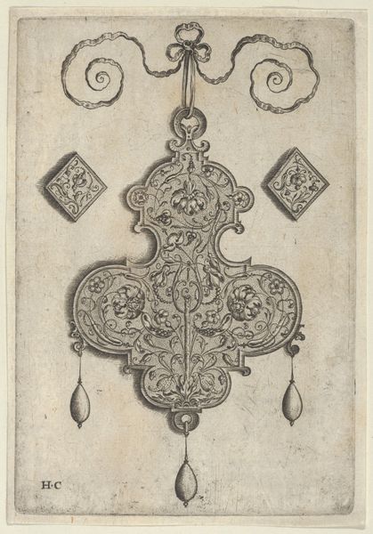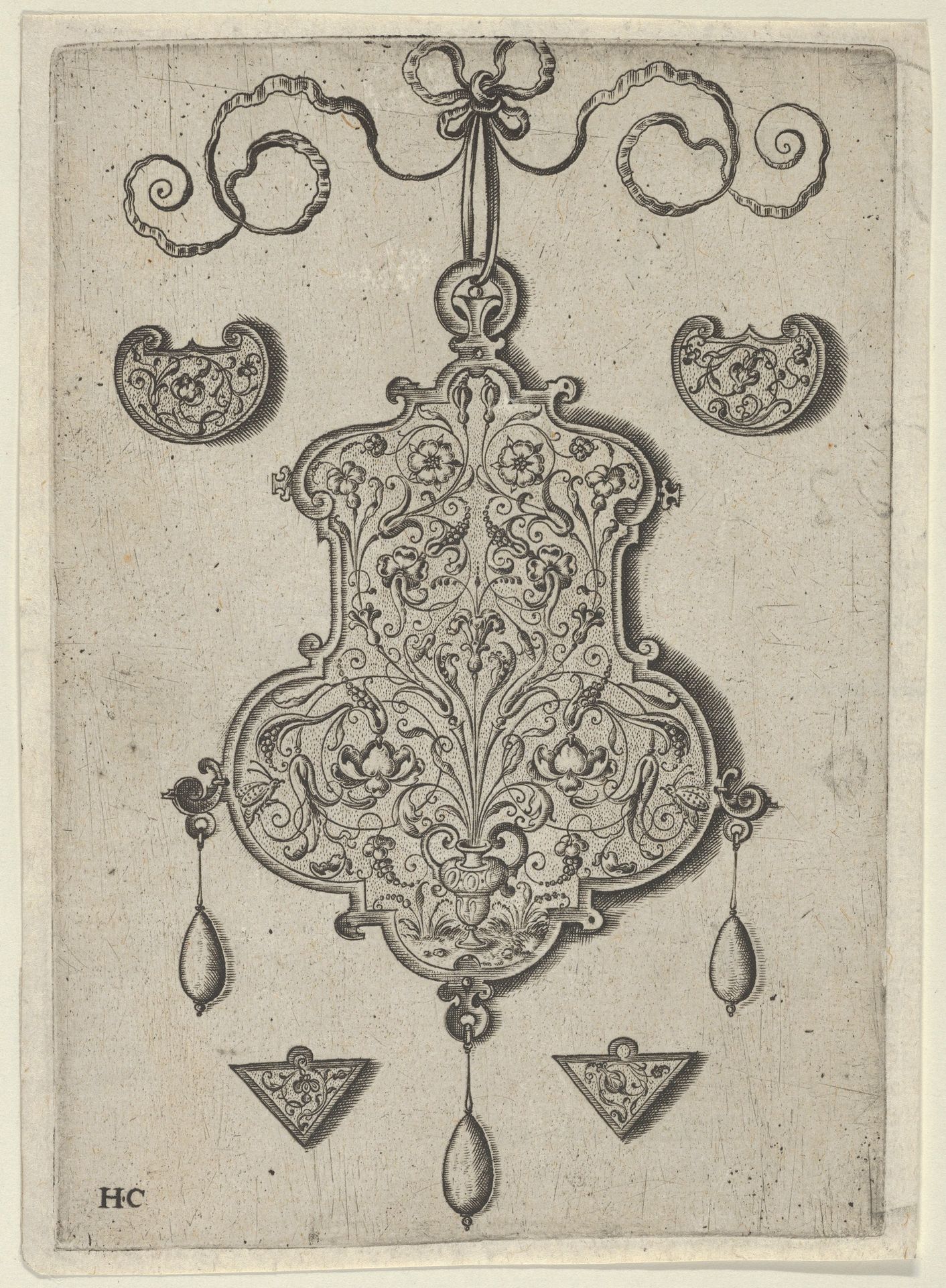
1530 - 1573
Design for the Verso of a Pendant with a Flower-Piece at Bottom Center
Listen to curator's interpretation
Curatorial notes
Editor: Here we have a "Design for the Verso of a Pendant with a Flower-Piece at Bottom Center" created sometime between 1530 and 1573 by Jan Collaert I. It's an engraving, which makes it an intaglio print and a drawing. At first glance, it strikes me as incredibly intricate. What's your take on this elaborate pendant design? Curator: Ah, a fleeting glimpse into a Renaissance mind, perhaps! For me, this piece sings a silent song of potential. It is not just a pretty bauble blueprint but an echo of the artisan's hand—the *idea* of adornment taking flight before it becomes tangible. Can you sense the hours of patient toil just beneath the surface of the print? Editor: Absolutely, there's a real sense of precision in the lines. I was wondering about the flower motif – does that carry any particular symbolism in Renaissance jewelry design? Curator: Flowers, those fleeting beauties, always whispered of love, transience, and rebirth! And in a jewel, a tiny captured Eden. I imagine this pendant catching the light, reflecting secrets whispered in dimly lit chambers. Makes you wonder, doesn't it, who might have worn such a treasure? Or better yet... what stories it might tell! Editor: It really does bring it to life to think of it being worn, sparkling with hidden meanings. It gives a new depth to what initially just seemed like a pretty design. Curator: Exactly! It’s a reminder that even the most seemingly decorative things can be dense with symbolism, craft, and the very pulse of the people who dreamed them up. Each flourish, each tiny flower—a tiny piece of the past winking at us.