Copyright: Public domain
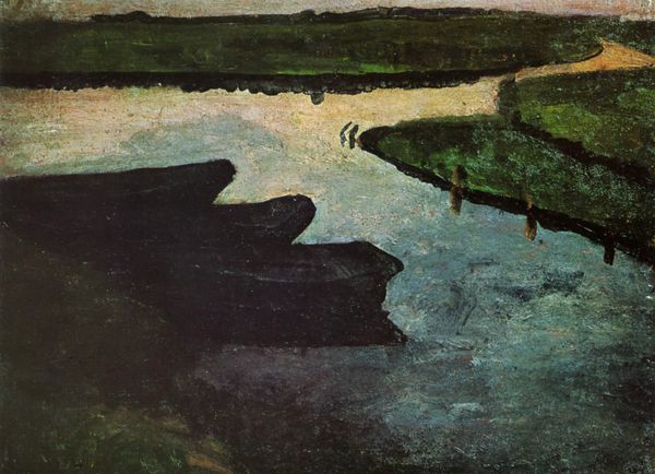
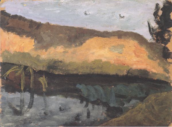
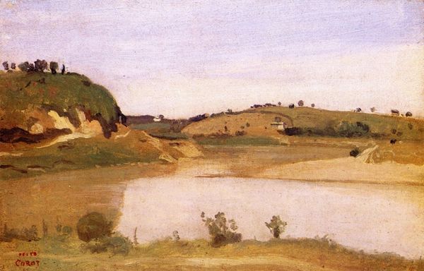
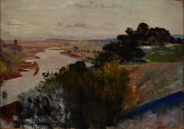
Editor: Here we have Piet Mondrian's "At the Amstel Sun," an oil on canvas completed in 1907. The palette is mostly muted greens and browns, and I find it quite serene. How would you interpret this work through a formalist lens? Curator: Serenity is certainly present, yet the undercurrent of dynamic formalism deserves scrutiny. Observe how Mondrian orchestrates horizontals against verticals. The shoreline, juxtaposed with the implied verticality of the solitary tree at the edge of the shore, immediately sets up a play with directionality. Do you discern how the composition itself forges the artwork’s essence? Editor: I see the lines you mention. It feels almost like the painting is searching for order, yet the soft edges and blended colors soften that quest for perfect geometry. Curator: Precisely! The colour work deserves mention. These earthy tones, far removed from the later vivid Neoplasticism for which Mondrian became famous, suggest a transitional moment. Note how the tonality informs depth: darker values ground us while the muted hues in the background offer a receding atmospheric perspective. Editor: I see it, yes. So it's not just about what is represented but how it's represented through these visual elements. What do you think the colour suggests about the artwork? Curator: These colours seem less interested in replicating the visible world as much as the artist is trying to invoke something spiritual, even if in an earlier representational way. Editor: I’ve definitely got a better understanding of Mondrian's use of color. I'll keep that in mind in the rest of the gallery today! Curator: Indeed. Close examination yields more than meets the eye, shaping our appreciation for art.
Comments
No comments
Be the first to comment and join the conversation on the ultimate creative platform.
More like this