drawing, paper, ink
#
drawing
#
neoclacissism
#
paper
#
ink
#
geometric
Dimensions: height mm, width mm
Copyright: Rijks Museum: Open Domain
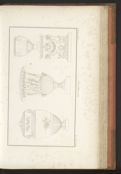
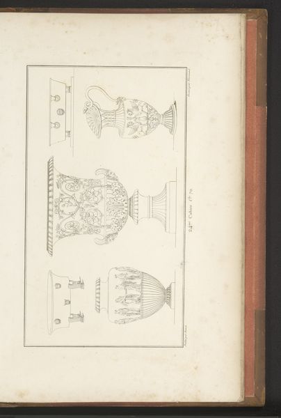
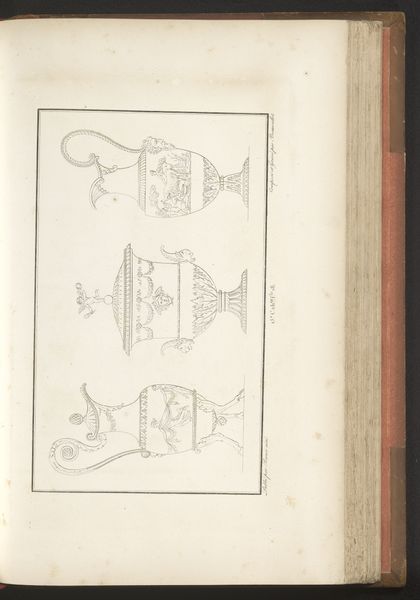
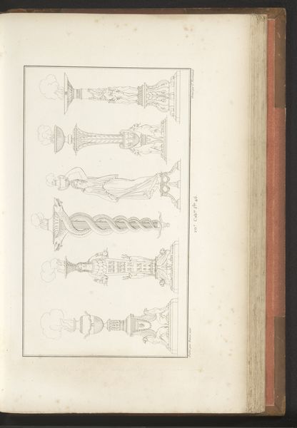
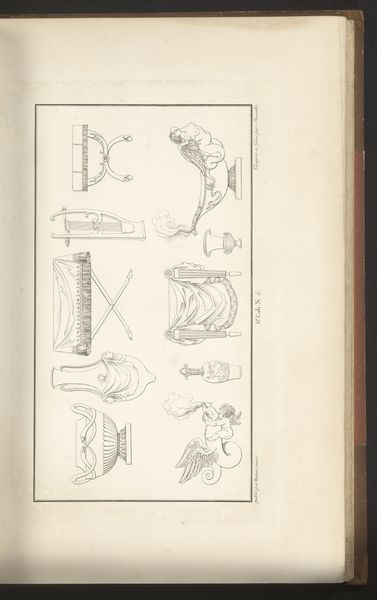
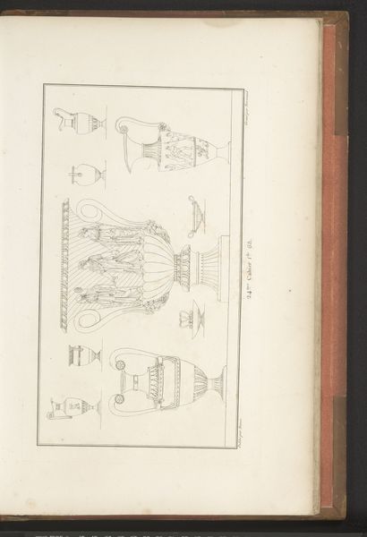
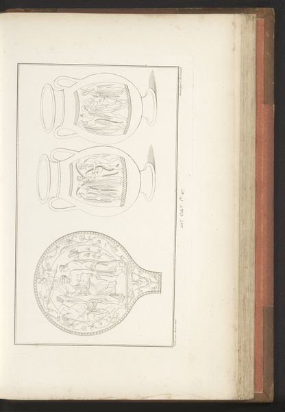
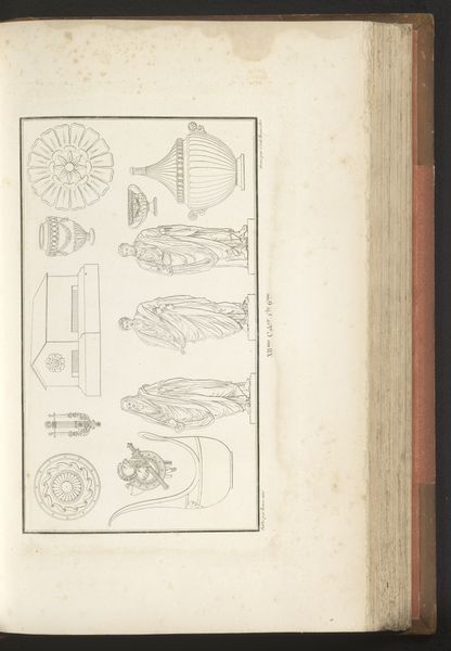
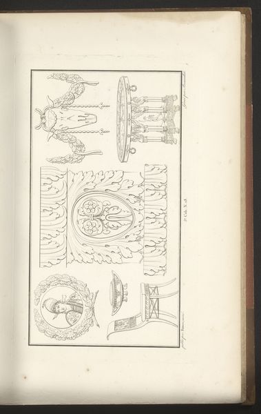
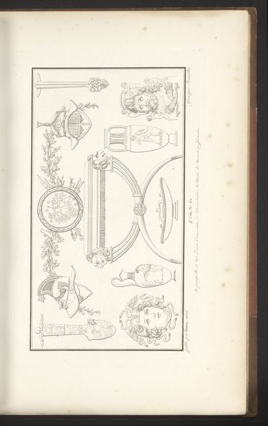
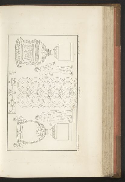
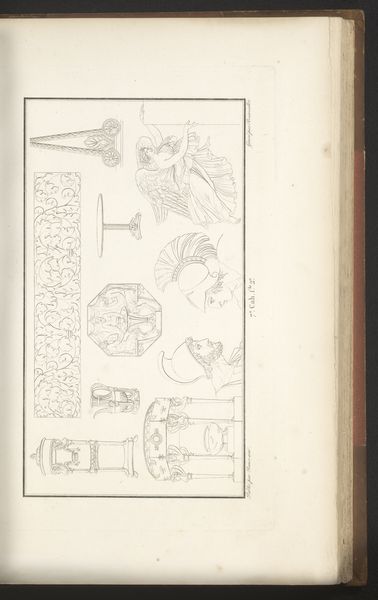
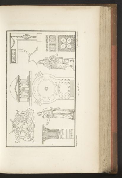
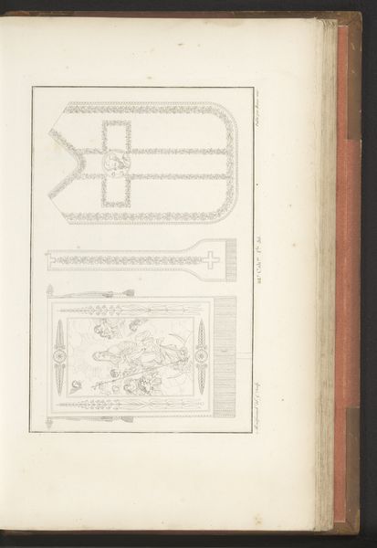
Curator: What we have here is “Vazen en schalen” by Charles Pierre Joseph Normand, dating back to 1820. Executed with ink on paper, this drawing reflects the Neoclassical fascination with form and precision. Editor: My immediate impression is one of cool elegance. The muted tones, the careful linework... It’s almost austere in its beauty. There’s a real sense of order and balance, a far cry from the exuberance of earlier periods. Curator: Absolutely. Neoclassicism drew heavily on the art and culture of ancient Greece and Rome, viewing it as a golden age of reason and aesthetic perfection. Note how Normand emphasizes the geometric shapes and symmetry in these vase and bowl designs. It's not just about decoration; it's about embodying principles of clarity and harmony. Editor: The objects themselves feel almost like mathematical studies rather than purely aesthetic pieces. I mean, you can see that they were destined for elite homes, speaking volumes about the social status and cultivated taste of those who acquired items like these. Do you think that they truly represented everyday taste or was it more like an exclusive signifier for a closed circle? Curator: An interesting point, undoubtedly items like these became emblems of taste but their significance cuts both ways. The imagery woven into these forms, often classical scenes and motifs, held deep cultural resonance. Consider the subtle ways that power, virtue, and history are communicated through those choices, perpetuating the values of the elite through everyday objects. The power of classical imagery made it universal but yet another social language, understandable and exclusive. Editor: I agree—the visual vocabulary is dense, reinforcing existing hierarchies. It reveals so much about how elites cultivated a connection to a prestigious past, consciously constructing their identity. They looked for every possible detail. This print normalizes and promotes particular worldviews for centuries. Curator: And what's fascinating is that, despite the apparent coolness of the style, these objects were intended to stir emotions. The goal was not just to create visually pleasing things, but also to inspire admiration and reflection on civic virtue. Editor: Well, on a simple design perhaps. As we have noted, the emotional punch has more layers for complex analysis! Seeing these idealized forms laid out together like this is interesting – it reminds me of an architectural rendering, each one trying to give a vision to the buyer about which option would best speak to his place in the world. It gives such clear clues to power through imagery. I suppose we've gotten a lot from this. Curator: We certainly have. "Vazen en schalen" demonstrates the period’s emphasis on both aesthetic beauty and a deep engagement with the visual language of classical antiquity.
Comments
No comments
Be the first to comment and join the conversation on the ultimate creative platform.
More like this