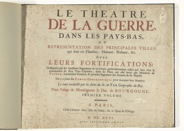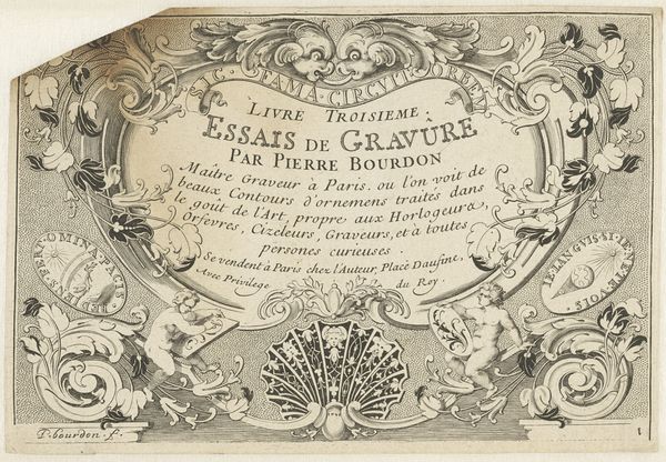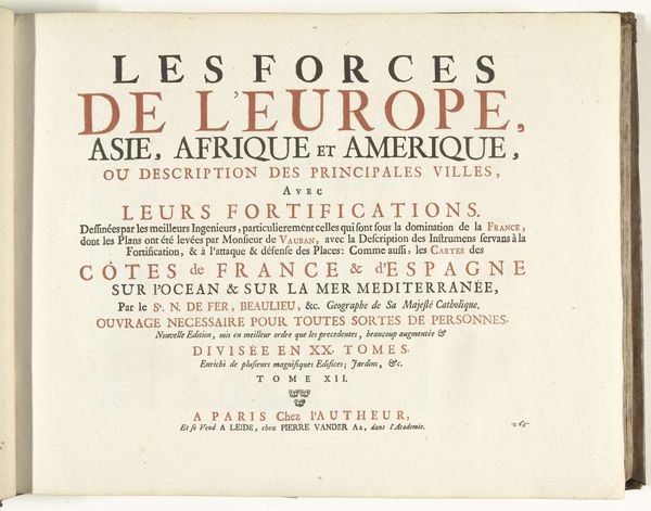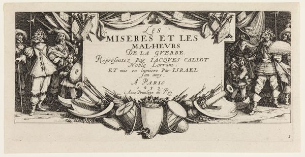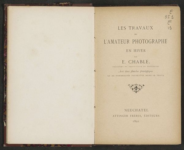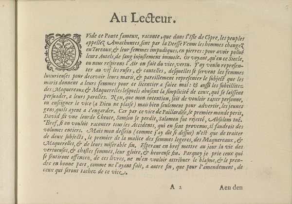
Tekstblad met de titel van een prentserie naar de schilderijen van Gerard de Lairesse in de Raadkamer van het hof van justitie te Den Haag 1737
0:00
0:00
nicolaasverkolje
Rijksmuseum
graphic-art, print, paper, typography, engraving
#
graphic-art
#
dutch-golden-age
# print
#
paper
#
typography
#
engraving
Dimensions: height 528 mm, width 365 mm
Copyright: Rijks Museum: Open Domain
Curator: At first glance, it’s just typography. I feel…organized, directed, maybe even a little controlled by all the information it seems to want to impart. Does that resonate? Editor: We’re currently viewing a text sheet from 1737, titled "Tekstblad met de titel van een prentserie naar de schilderijen van Gerard de Lairesse in de Raadkamer van het hof van justitie te Den Haag." Essentially, it's the title page for a series of prints made after Gerard de Lairesse's paintings. The prints were based on drawings by Nicolaas Verkolje. Curator: Okay, "paintings in the courtroom," that adds some drama, doesn't it? Immediately, it feels so deliberately composed – a kind of balanced, almost legal…dare I say, judged aesthetic? The symmetrical layout…it speaks of order. Editor: Absolutely. If we dissect its structure, you'll notice it's divided into two distinct blocks – one in Dutch, the other in French, catering to a broader audience, no doubt. This bi-lingual presentation immediately signals a sense of cosmopolitanism, aligning with the Dutch Golden Age's commercial reach. The typography itself is a blend of Roman and italic fonts, a deliberate stylistic choice to create visual hierarchy. Curator: And I am particularly drawn to the phrase “door de beste graveerders in’t koper gebragt"…carried out by the best engravers. It hints at craft pride, a real investment in the quality of reproduction. It makes me want to actually see the copperplates. The tactility feels totally present, despite being absent! Editor: The medium, engraving on paper, amplifies that inherent precision. This isn't merely about replicating Lairesse's paintings. It’s about translating their grandeur into a portable, reproducible format. Consider the placement of Verkolje’s name: although Lairesse painted the originals, it's Verkolje's drawings the engravings are based on, foregrounding the reproductive process itself as artistry. Curator: It also feels promotional in a way. Laying claim! “Look what we’ve created! Buy it!” Yet done with such elegance…it elevates commerce into high culture, doesn’t it? Editor: Precisely! Ultimately, this text sheet becomes an object of art, one designed to promote another. It shows that art is fundamentally interconnected with power and cultural currency. Curator: So more than information, this little rectangle is trying to show us a system of translation, skill and even political will... Fascinating how much energy this little piece manages to contain.
Comments
No comments
Be the first to comment and join the conversation on the ultimate creative platform.
