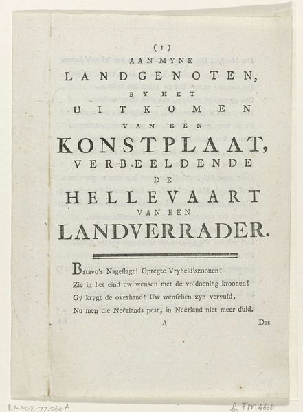
print, typography, engraving
#
script typography
#
hand-lettering
# print
#
lettering
#
hand drawn type
#
hand lettering
#
typography
#
hand-written
#
hand-drawn typeface
#
fading type
#
geometric
#
stylized text
#
engraving
#
small lettering
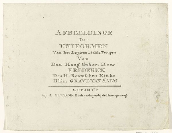
Dimensions: height 75 mm, width 100 mm
Copyright: Rijks Museum: Open Domain
Editor: Here we have an engraving from 1785, currently residing in the Rijksmuseum. It’s titled "Serietitel," and its creator is listed as anonymous. It looks like a title page, a somewhat formal announcement rendered entirely in precise lettering. I find its austerity and order quite striking. What do you see in this piece? Curator: Ah, yes! "Serietitel." Just rolls off the tongue, doesn’t it? Well, I’m immediately drawn to the way it whispers of a very different time. The late 18th century! Imagine quills scratching across parchment, the meticulous work of crafting each letter. It's not just information; it's a performance. Look closely at the different letter sizes and fonts. What does that tell you about emphasis and hierarchy back then? Almost like a Baroque symphony, wouldn't you say, but played out in ink. It practically smells of old paper and political intrigue, don't you think? Editor: Yes, now that you mention it, the varied fonts do feel…performative. So, what story do you think it's trying to tell? Curator: I think it's subtly boasting! Announcing the arrival, or perhaps the commissioning, of a series about military uniforms – very fashionable at the time, you know. And note the honorifics bestowed upon Frederick, this "Rhijn Grave van Salm." Titles were currency! The engraver isn't just creating art, they are crafting an image of power, tradition, and perhaps even a dash of the new 'military chic'. We take typography for granted today, but back then, it was another sword in the arsenal of representation. Makes you think, doesn't it, about what our fonts will say about us in a few centuries. Editor: That’s fascinating. I hadn’t considered the performative aspect so explicitly. Now, I’m seeing this “title page” as something more complex, a kind of subtle, formal marketing piece. Curator: Exactly! And that, my friend, is why history, even when whispered in tiny letters, is endlessly surprising. Now, about that Grave van Salm... what kind of man do *you* imagine he was? Perhaps a military fop, or a courageous commander? It’s all in the interpretation!
Comments
No comments
Be the first to comment and join the conversation on the ultimate creative platform.
More like this