drawing, paper, ink, pen
#
drawing
#
dutch-golden-age
#
pen sketch
#
sketch book
#
landscape
#
paper
#
ink
#
pen
#
realism
Copyright: Rijks Museum: Open Domain
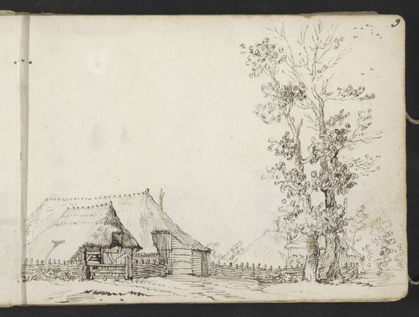
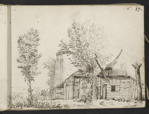
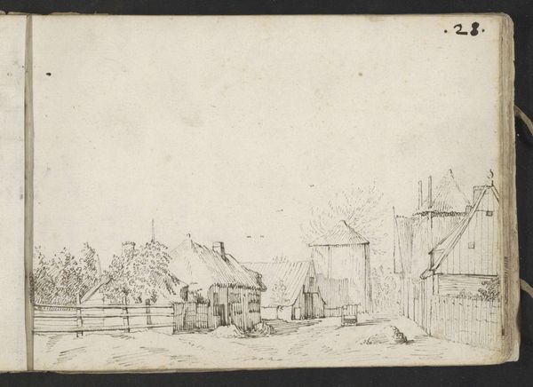
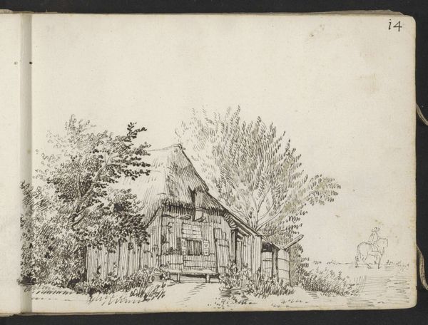
Editor: This pen and ink drawing is entitled "Paardenkar voor een boerenwoning," or "Horse cart in front of a farmhouse," by Gerard ter Borch II, from around 1631 to 1633. It has a kind of humble charm, a raw and unpretentious depiction of rural life. What elements stand out to you, especially given your expertise? Curator: The linear quality immediately captures my attention. Ter Borch uses line weight variation with such deftness. Note the density of strokes that articulate the thatched roof, juxtaposed with the more delicate rendering of the trees. Do you see how this contrast creates a hierarchy, directing the eye through the composition? Editor: I see it. It almost creates texture in the thatch and contrasts with the spareness of the tree branches. The line work definitely brings attention to that architectural detail first. Curator: Precisely. The very intentional structure reinforces a thematic stability. Ter Borch has a command of space despite the minimal use of tonal shading. How do you perceive the relationship between the architecture and the surrounding landscape? Editor: The farmhouse is solid, very defined, compared to the loosely defined trees and wagon. It grounds the image in reality and almost presents nature as more transient. What does that signify about the values he may be encoding through the formalism? Curator: It emphasizes a prioritization of human construction versus the fluidity of nature, or order over nature's spontaneity, which are frequent tropes found within 17th-century Dutch landscapes. Ter Borch carefully modulates the density of ink to simulate depth, a crucial technical component in establishing pictorial space. Notice how, despite the sketch-like quality, he's deeply attentive to proportion, to constructing a believable perspectival recession. That balance between precision and looseness—how does that inform your interpretation of the work's meaning? Editor: I guess I saw the roughness first, and I didn't fully consider how strategically it might be applied. I see a planned structure now that you have pointed it out, not just a simple rural scene. Thanks, that really helps! Curator: Indeed. Every formal element becomes a signifier, pointing towards the artist's intention, in grounding the Dutch landscape as a construct, carefully composed rather than merely observed.
Comments
No comments
Be the first to comment and join the conversation on the ultimate creative platform.
More like this