1461 - 1511
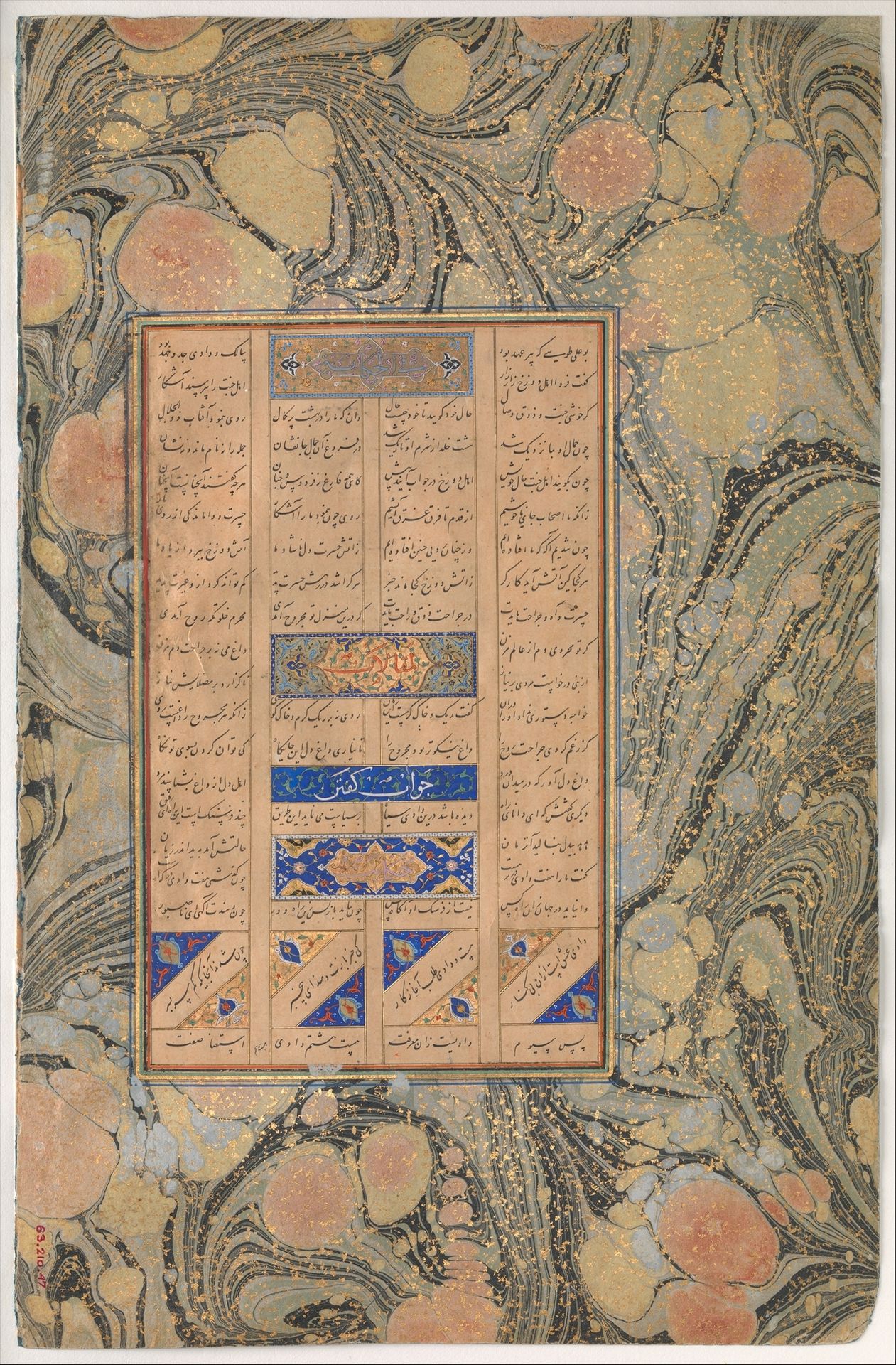
"Allusion to Sura 27:16", Folio from a Mantiq al-Tayr (Language of the Birds)
Farid al-Din `Attar
1142 - 1220The Metropolitan Museum of Art
Metropolitan Museum of Art, New York, NYListen to curator's interpretation
Curatorial notes
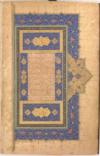
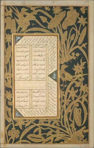
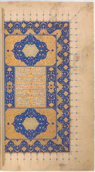
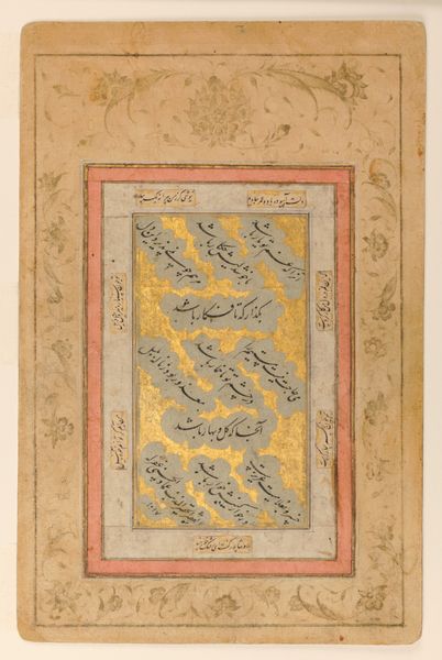
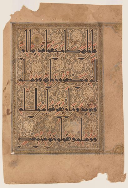
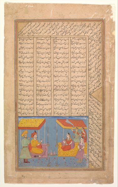
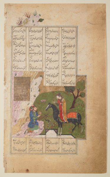
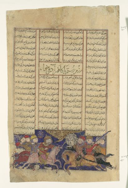
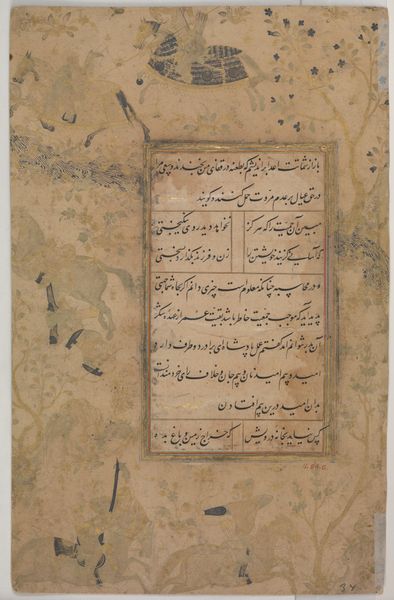
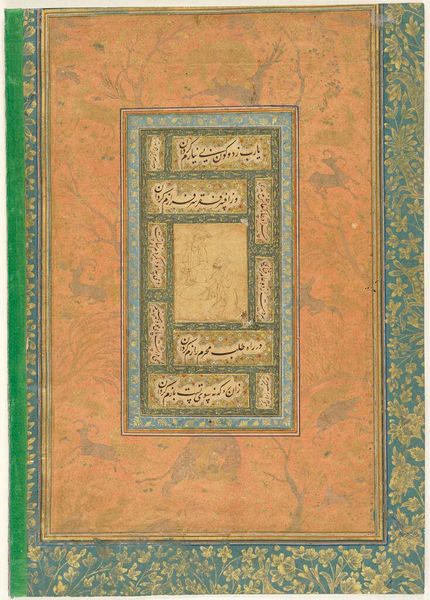
Editor: Here we have "Allusion to Sura 27:16," a folio from a *Mantiq al-Tayr* created between 1461 and 1511, attributed to Farid al-Din `Attar. It's a mixed-media work, including ink, watercolor, and colored pencil on paper. The first thing I notice is the stunning marbled border – it seems to float around the central text. How would you interpret this piece, considering its formal elements? Curator: The marbled border certainly establishes a dynamic ground. Its swirling patterns create a visual tension against the rigid geometry of the text blocks. Note the contrast between the organic fluidity of the marbling and the calligraphic precision within the frame. How does this interplay inform your understanding? Editor: I see it as a sort of contained chaos. The marbled edges are unrestrained, while the text is highly ordered and segmented. It's almost as if the text is trying to impose order onto the natural world, or perhaps vice versa? Curator: An astute observation. Consider the relationship between these elements. The calligraphic text, divided into distinct blocks and decorative cartouches, presents a structured system of visual signs. Its inherent logic depends on its legibility. How does the use of color and geometric patterns reinforce or disrupt that logic? Editor: The colors in the text blocks – blues and golds, mostly – feel symbolic and important. The geometrical patterns definitely make me focus on certain phrases or sections, almost highlighting them. It makes me wonder what they emphasize! Curator: Precisely. The illumination directs the viewer’s eye, emphasizing particular verses. This act of directing attention alters our reception of the overall textual structure. Now, how might we understand that marbling outside the frame in relation to this deliberate visual orchestration within? Editor: I see what you mean. I think it brings a lot of interesting depth, to understand the contrasts within this page from the artist's choice in materials, structure and shapes, to understanding that those all function together. Curator: Indeed. By focusing on the formal elements and their interactions, we've gained a deeper appreciation for the artistic choices involved and how they shape meaning in this illuminated manuscript page.
