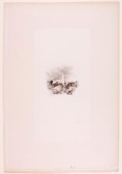
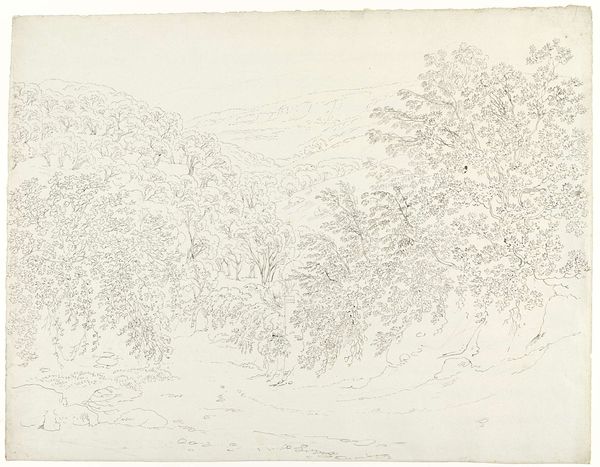
drawing, print, ink, engraving
#
drawing
#
thin stroke sketch
# print
#
old engraving style
#
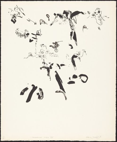
hand drawn type
#
landscape
#
ink line art
#
ink
#
hand drawn
#
pen-ink sketch
#
thin linework
#
abstraction
#
line
#
pen work
#
scratch sketch
#
engraving
#
initial sketch
Copyright: National Gallery of Art: CC0 1.0
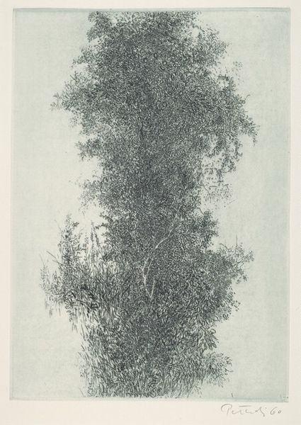
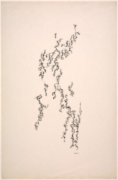
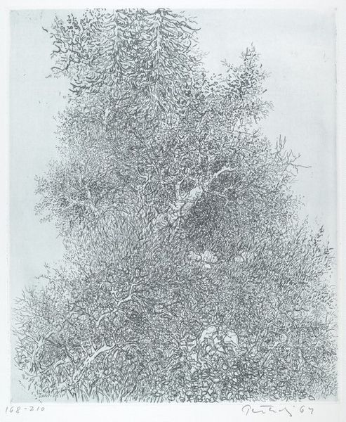
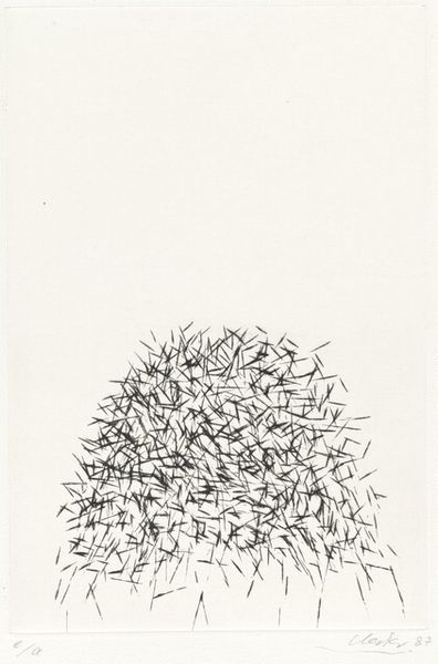
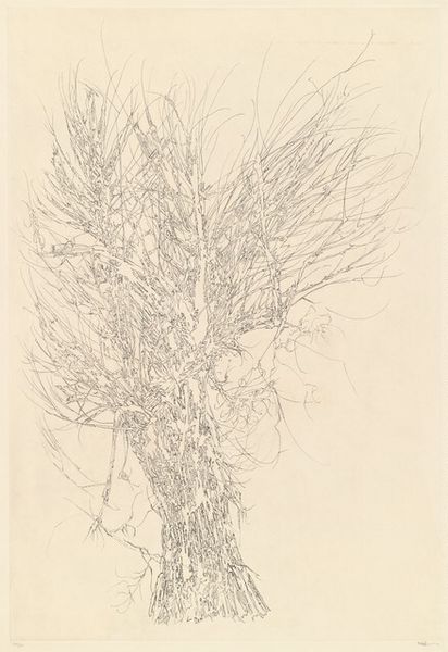
Editor: Peter Takal’s “Winter,” created in 1963, seems like a world seen through frosted glass. The use of ink in a detailed drawing, reminiscent of old engravings, gives it a stark, almost barren quality. What's your take? What jumps out at you? Curator: Barren is an interesting word for it. To me, there is an element of the vibrant, feverish, natural world that feels far from infertile and even hints to more optimistic visions. You know, Winter holds the secret promise of Spring, doesn’t it? And just as seeds slumber beneath a blanket of snow, waiting for their cue to burst forth, so does Takal’s use of thin lines, scratchy details, and overall mark making imply that potential energy is at play. Do you see the way that it hints at explosive dynamism that almost fights back against the idea of Winter as a season? Editor: I see what you mean. The dense collection of tiny details really prevents a single, still perception of “Winter”. Now that I think about it, the term feels too absolute and one-sided. Is this sense of ambiguity typical of his work? Curator: Takal consistently avoided concrete representation; instead, he invites us to complete his visual statements, to engage in the meaning-making. This quality also echoes what other abstractionist landscape artists, such as Agnes Martin or Julie Mehretu, are doing with lines. These figures used an array of strokes to challenge the viewer with incomplete perspectives. It would be difficult to label Winter a drawing without volume. I wonder how can drawing without depth communicate cold, starkness, barrenness, or the promise of fertility and nature, and all the rest you have insightfully named? Editor: I suppose it’s the absence of solid forms, combined with those concentrated marks, that creates a sensation… almost a chilling hum? Curator: Indeed! We often expect to see well-formed depictions to better associate feelings with, which proves a very good concept when attempting art production ourselves. Thanks to artists such as Takal, though, there is not always one answer on how best to express meaning or create a strong image. Editor: That's such a great point. I really hadn't thought of abstraction this way before, as something incomplete to participate with rather than passively interpret. Thanks!
Comments
No comments
Be the first to comment and join the conversation on the ultimate creative platform.
More like this