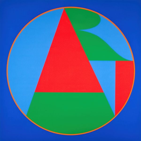
screenprint, print, acrylic-paint
#
screenprint
# print
#
acrylic-paint
#
form
#
geometric pattern
#
geometric
#
geometric-abstraction
#
abstraction
#
pop-art
#
line
#
modernism
Copyright: Modern Artists: Artvee
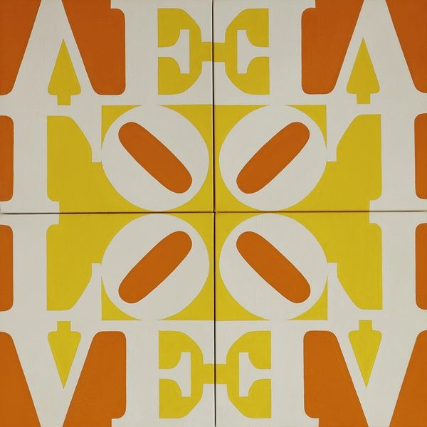
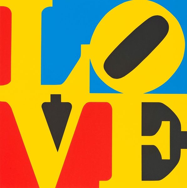
Robert Indiana made "Love Wall, from Formen der Farbe," using a screen printing process which is all about layering blocks of flat colour to build up an image. Here, the colour palette is tight – red, green, and blue. Indiana doesn’t mess with the recipe too much: the colours are solid and unblended. It's a hard surface. The edges where the shapes meet are super clean. The stacked “LOVE” is so iconic, it's almost invisible. Like, the feeling of love is so enormous and universal that it’s easy to glance over. The tilted “O” creates a sense of imbalance, which is a clue to how the work operates. Think about the space between the letters, the way they push against each other, creating tension and energy. It’s like a visual poem, where each element plays off another to create a feeling. Agnes Martin comes to mind, with her use of grids and colors to evoke emotion. Ultimately, "Love Wall" invites us to consider the power of art to express ambiguity.
Comments
No comments
Be the first to comment and join the conversation on the ultimate creative platform.
More like this