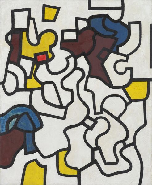
painting, acrylic-paint
#
de-stijl
#
non-objective-art
#
painting
#
acrylic-paint
#
abstract
#
geometric pattern
#
geometric
#
modernism
Copyright: Public Domain: Artvee
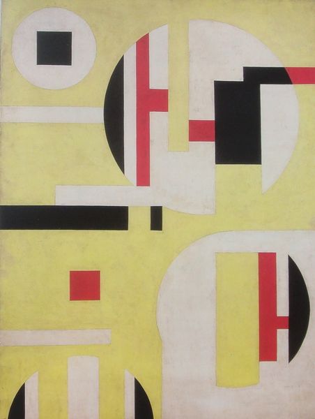
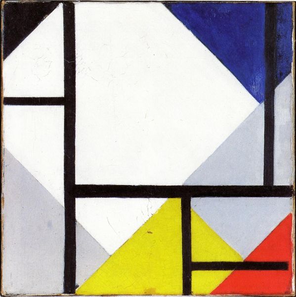
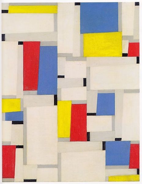
Editor: We're looking at Theo van Doesburg's "Variation on Composition XIII," created in 1918. It’s an acrylic painting. What strikes me immediately is the way these soft color fields are intersected by those definitive black lines. What do you make of it? Curator: I note that Van Doesburg has meticulously explored the spatial relationships between these elementary forms. The orthogonality, though seemingly rigid, is in fact subtly destabilized by the introduction of the curved planes. The palette too—the primary colors offset against the white ground— speaks to De Stijl’s tenets. Editor: Do you think there is a deliberate attempt at asymmetry? It’s like he's pushing against a grid without fully abandoning it. Curator: Precisely. It seems the black lines act as visual armatures around which these tonal regions are distributed. Consider how the lines' thickness impacts the negative space around the colorful forms, creating dynamic tension, though the overall impression might be that of a harmonious composition. Are we seeing a truly non-objective form or could we interpret this work as being more representational than abstract? Editor: That’s fascinating! It almost feels architectural, with those color blocks like fragments of buildings, interrupted by the firm structure of the lines. Curator: I find your observation insightful. The formal vocabulary employed mirrors the emerging aesthetics of modern architecture at the time, with functionality and rationality presented, yet playfully disrupted. Editor: I hadn’t considered that! Thanks for that detailed analysis, I am now seeing a dynamic tension within what seemed to be, at first glance, a peaceful, composed arrangement of color. Curator: The piece beautifully illustrates the tension that Van Doesburg so successfully creates through subtle manipulation of color and structure.
Comments
No comments
Be the first to comment and join the conversation on the ultimate creative platform.
More like this