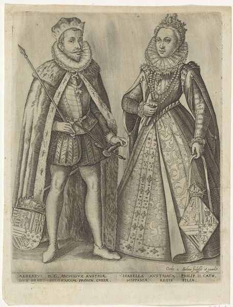
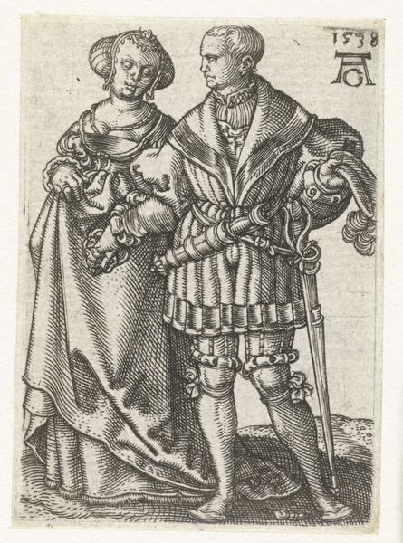
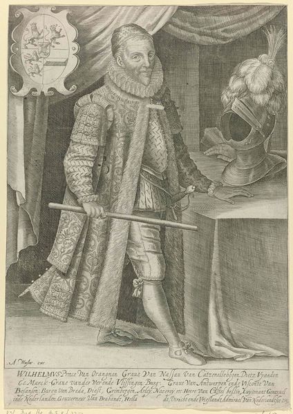
Dubbelportret van Jacobus I van Engeland en Anna van Denemarken, koning en koningin van England 1601 - 1605
0:00
0:00
wierix
Rijksmuseum
engraving
#
portrait
#
baroque
#
group-portraits
#
history-painting
#
academic-art
#
engraving
Dimensions: height 286 mm, width 225 mm
Copyright: Rijks Museum: Open Domain
Editor: We're looking at a rather formal double portrait here: "Dubbelportret van Jacobus I van Engeland en Anna van Denemarken, koning en koningin van England," dating from around 1601-1605, currently housed in the Rijksmuseum. It's an engraving by Wierix. There's a stillness about the composition, and it almost feels like they are figures staged for a play. What catches your eye, viewed strictly from a formal perspective? Curator: The pronounced contrast achieved through line work is what first strikes me. Note how Wierix leverages varied hatching techniques to sculpt the forms, differentiating textures—from the velvety softness of Anna's gown to the harder surfaces of James' armor and weapon. The balance between light and shadow articulates depth, while linear precision defines shapes and contours with extraordinary detail. What compositional elements guide your gaze? Editor: The Queen's dress, in particular, with the ruff and elaborate embroidery—draws the eye, but it's almost overwhelming in its intricacy. It leads back and forth, creating some unease as my eye doesn't have a resting point. Do you think there's a purpose behind such intensity? Curator: Observe the intentional tension embedded within its structure. The intricate surface ornamentation might seem excessive; however, each meticulous detail—the precise arrangement of lines and textures—enhances our sensory engagement. Does this complexity contribute to or detract from your reading of their status as the ruling elite? Editor: It’s interesting. Thinking about it, maybe that complexity conveys power and wealth through detailed visual language rather than a focus on color, given the medium. Curator: Indeed. This work beautifully demonstrates how form alone is potent with meaning. My understanding of portraits from this period has certainly shifted after seeing Wierix’s use of texture here. Editor: Absolutely, paying closer attention to such structural devices and surface articulation illuminates fresh interpretive possibilities.
Comments
No comments
Be the first to comment and join the conversation on the ultimate creative platform.
More like this