Curatorial notes
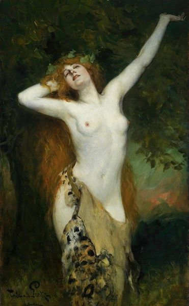
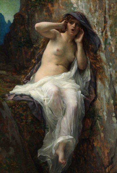
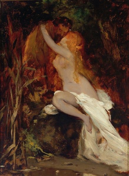
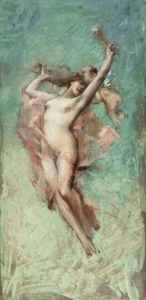
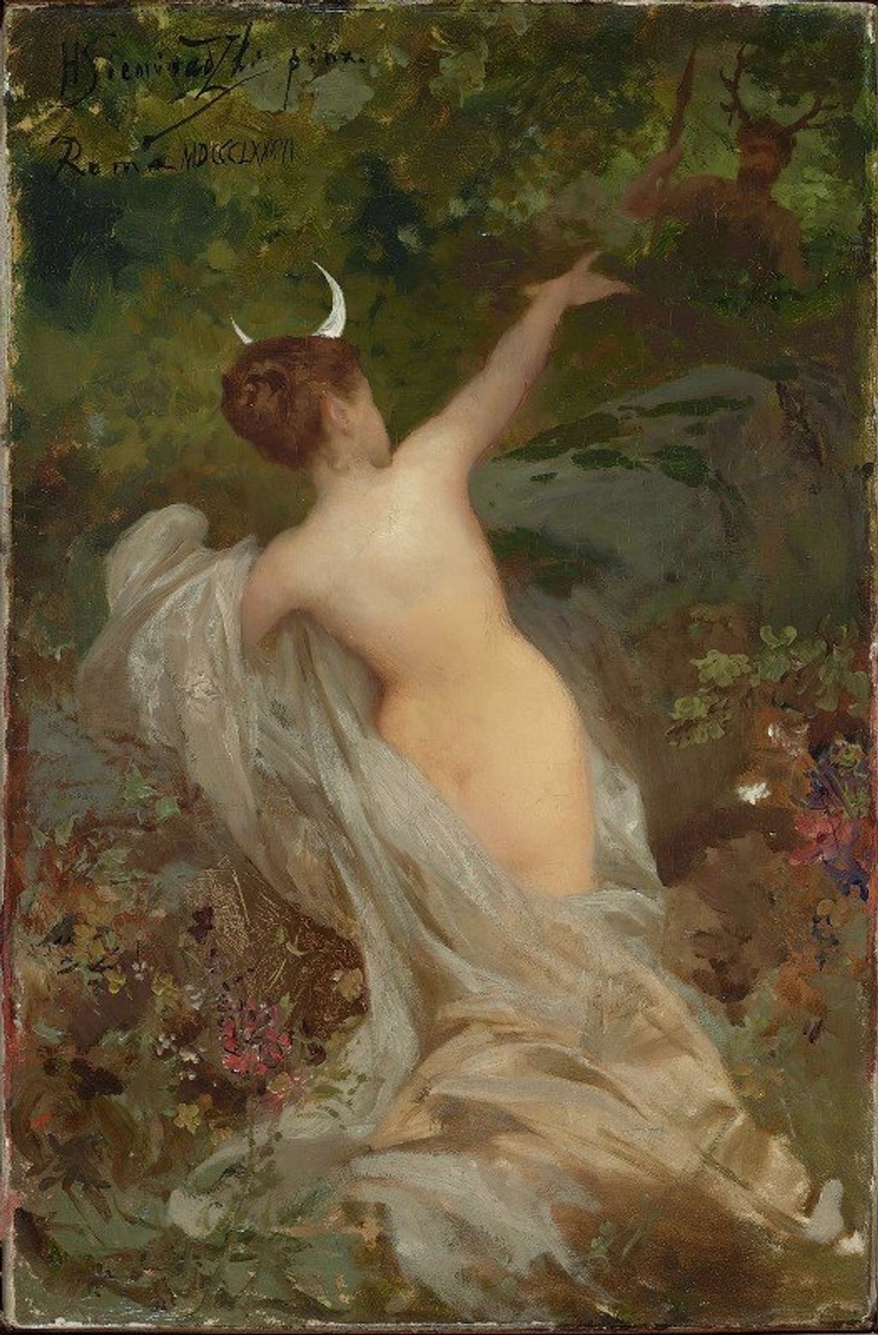
Editor: Here we have Henryk Siemiradzki's "Diana and Actaeon," created in 1886, using oil paint and gouache. What immediately strikes me is how the light catches on the figure's back and drapes, contrasting with the darker, almost secretive forest behind her. What do you see in this piece? Curator: Immediately apparent is Siemiradzki's masterful use of chiaroscuro to highlight the figures. Observe how the application of paint emphasizes texture; the smooth, almost porcelain-like skin of Diana juxtaposed with the rougher, impastoed brushwork used to depict the surrounding foliage. Does this contrast create a visual hierarchy in your mind? Editor: Absolutely. It definitely guides my eye towards Diana, but I also notice the figure in the forest—Actaeon, right? His form seems almost…unfinished, less defined than hers. Curator: Precisely. This contrast serves to emphasize Diana's power and otherworldliness. Moreover, the linear arrangement and strategic color palette contribute to the painting's compositional balance. Notice how the curve of Diana's arm echoes the shape of the crescent moon on her head, creating a subtle visual rhythm. Do you think this repetition has significance? Editor: Perhaps it’s connecting her directly to her symbolic role, emphasizing her divinity? I never considered the repetition before, just the contrasts. Curator: It demonstrates a formal rigor, guiding our reading of the narrative. By carefully arranging visual elements such as form and contrast, Siemiradzki is prompting us to ponder the dichotomy of humanity and divinity and, visually at least, where the power lies. Editor: This has given me so much more to think about regarding not just the narrative, but the formal language being employed. Curator: Indeed. Analyzing those elements independently can truly alter your viewing.