Copyright: CC0 1.0
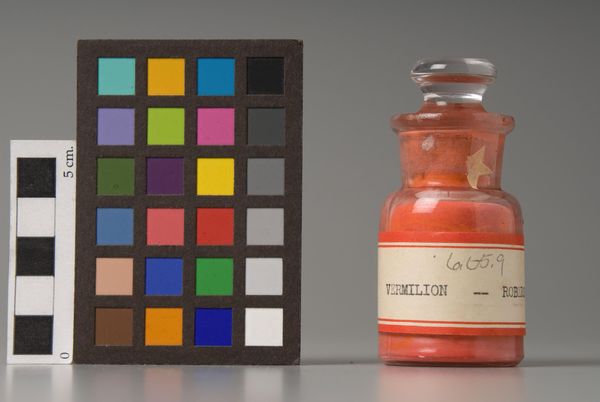
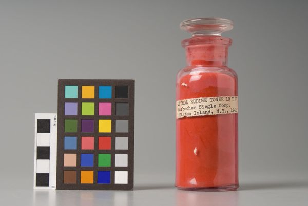
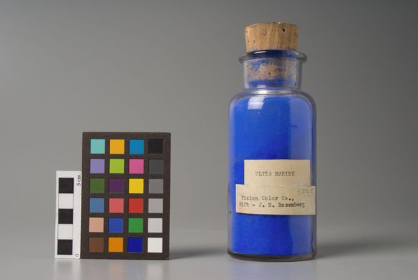
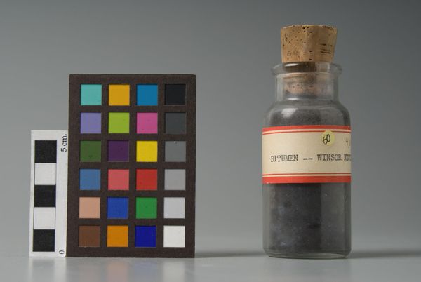
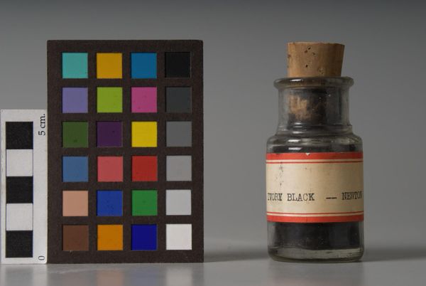
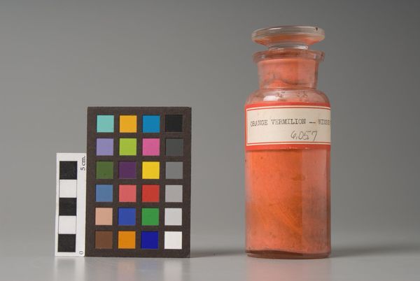
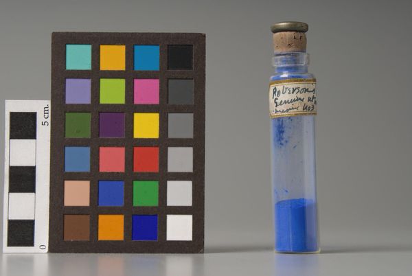
Editor: We're looking at 'Madder Lake Conc.', a pigment sample by Imperial Paper & Color Corp. The vibrant red is quite striking against the neutral background. What catches your eye in this composition? Curator: I'm intrigued by the formal relationships between the objects—the gridded color chart, the measuring scale, and the pigment jar. The composition highlights seriality and standardization, key aspects of industrial production. How do these elements interact visually? Editor: I see how the grid contrasts with the organic shape of the pigment powder inside the jar. The label's typography also seems very deliberate. Curator: Precisely. The label employs a clean, geometric sans-serif font, signaling modernity and efficiency. Consider how this contrasts with the handmade quality often associated with artistic creation. Do you perceive a tension there? Editor: Yes, absolutely. It's a fascinating intersection of art and industry.
Comments
No comments
Be the first to comment and join the conversation on the ultimate creative platform.