drawing, paper, ink
#
drawing
#
paper
#
ink
#
modernism
#
calligraphy
Copyright: Rijks Museum: Open Domain
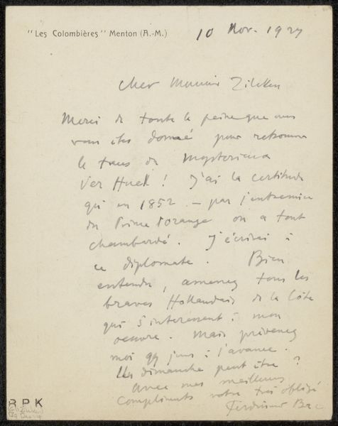
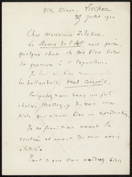
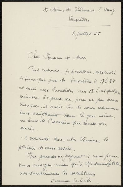
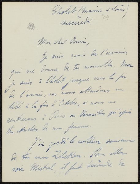
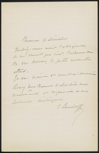
This invitation to Philip Zilcken, made in February 1928, is all about the flow of script, the personality of the hand. The ink sort of bleeds into the fibers of the page, doesn't it? You can see the way each letter is formed, sometimes looping and light, other times heavy and deliberate, like thoughts finding their shape as they move across the page. The surface itself has this lovely, aged quality. The paper seems thin, you can almost see the fibers. The ink sits right on top. Look at the “R.S.V.P.” – so formal, yet dashed off in a hurry! The whole thing feels so intimate, like a peek into someone’s daily life. The script feels energetic, direct, and human, a kind of mapping of a mind at work. I'm reminded of Cy Twombly, in a way, how he made grand gestures out of handwriting, elevated the everyday scribble to high art. Art’s just a conversation, isn’t it?
Comments
No comments
Be the first to comment and join the conversation on the ultimate creative platform.
More like this