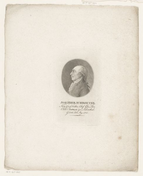
print, engraving
portrait
aged paper
toned paper
medieval
yellowing background
old engraving style
engraving
realism
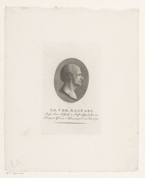
Dimensions: height 126 mm, width 82 mm
Copyright: Rijks Museum: Open Domain
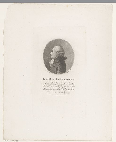
Editor: Here we have Heinrich Pfenninger’s "Portret van Melchior Pfintzing", an engraving from somewhere between 1759 and 1815. The crisp lines of the engraving, set against the aged paper, lend it an antique feel, almost haunting. What compositional choices strike you most powerfully? Curator: Primarily, the oval format contains the subject's likeness. The lines create tonal variation, giving the subject volume within a contained setting. Notice the artist's expert use of hatching to articulate shadow and form. Editor: Hatching? Curator: Yes, closely spaced parallel lines. Observe the density and direction. Where the lines converge, shadows deepen, lending dimension. This adds a layer of complexity to what seems like a simple portrait. Do you see a deliberate manipulation of the engraving itself, apart from the pure representation? Editor: I do now. The density creates a rich surface. Almost like texture, even though it is printed on paper. But why an oval, as opposed to a rectangle or square? Curator: That gets to a core tension. Why *this* shape? Because it focuses your gaze intently upon Pfintzing's face. Note how it contrasts with the paper which the image has been applied. The difference in colour affects how we interpret this engraving; had the paper been darker, the face would appear brighter in contrast, potentially affecting our engagement. Editor: That makes sense. By looking at the pure composition, not just who it depicts, we learn more about how images function. Curator: Indeed, the formal properties work together to generate meaning and evoke our curiosity.
Comments
No comments
Be the first to comment and join the conversation on the ultimate creative platform.