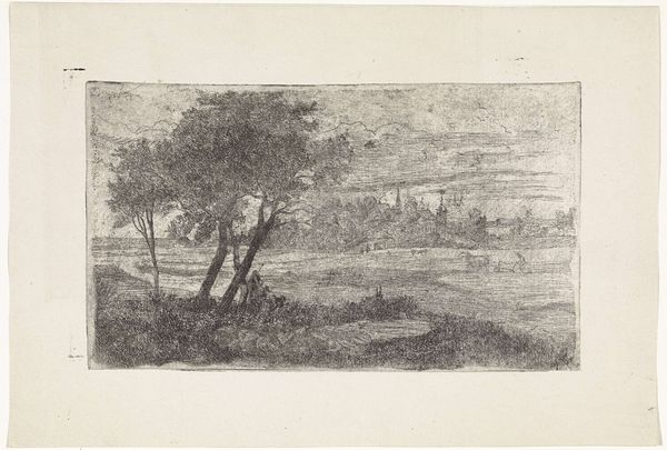
drawing, print, pencil
#
drawing
# print
#
pencil sketch
#
landscape
#
pencil
Dimensions: height 98 mm, width 123 mm
Copyright: Rijks Museum: Open Domain
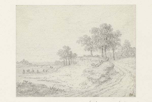
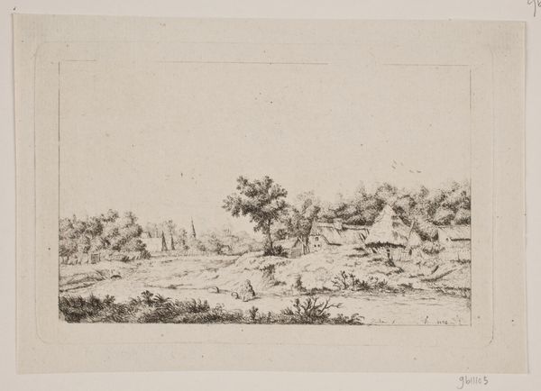
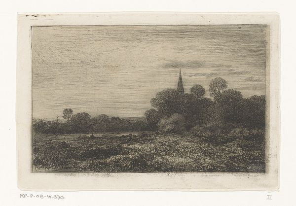
Editor: We’re looking at "Gezicht op Rhenen(?)" by Johannes Pieter van Wisselingh, likely made sometime between 1830 and 1878. It’s a pencil drawing and print. The hazy depiction almost makes it look like a dreamscape. What compositional elements stand out to you in this piece? Curator: Notice first the artist's calculated use of line. The etched lines create tonal variation and define spatial relationships. The density of lines determines darker areas which articulate the trees and buildings in contrast to the open expanse of the sky. The meticulous layering conveys atmospheric perspective, especially between foreground and background. Editor: So, it's less about capturing the literal appearance and more about the lines creating the mood and space? Curator: Precisely. We should observe that the textural quality is key. The rough texture is enhanced through varied pencil pressure. The interplay between rough strokes in the foreground and delicate shading on the buildings creates visual interest. Note how this conscious handling of the medium generates a tangible tension, structuring our gaze, and activating a visual and perhaps an emotional response. Editor: That’s a fascinating way to look at it, almost like the materials themselves are part of the story. Curator: Indeed. Formalism insists on the artwork’s inherent properties and that our response as viewers hinges upon close attention to formal structure and composition. We might ask: How does van Wisselingh engage his chosen medium, not only to record but to transform? Editor: I never considered looking at a landscape this way, it makes you really consider how an artist's choices contribute so much. Curator: Indeed, it prompts us to move beyond facile recognition and towards a deeper, structural engagement.
Comments
No comments
Be the first to comment and join the conversation on the ultimate creative platform.
More like this