Curatorial notes
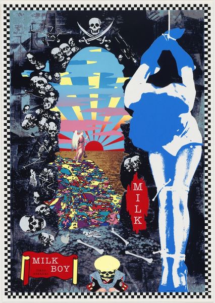
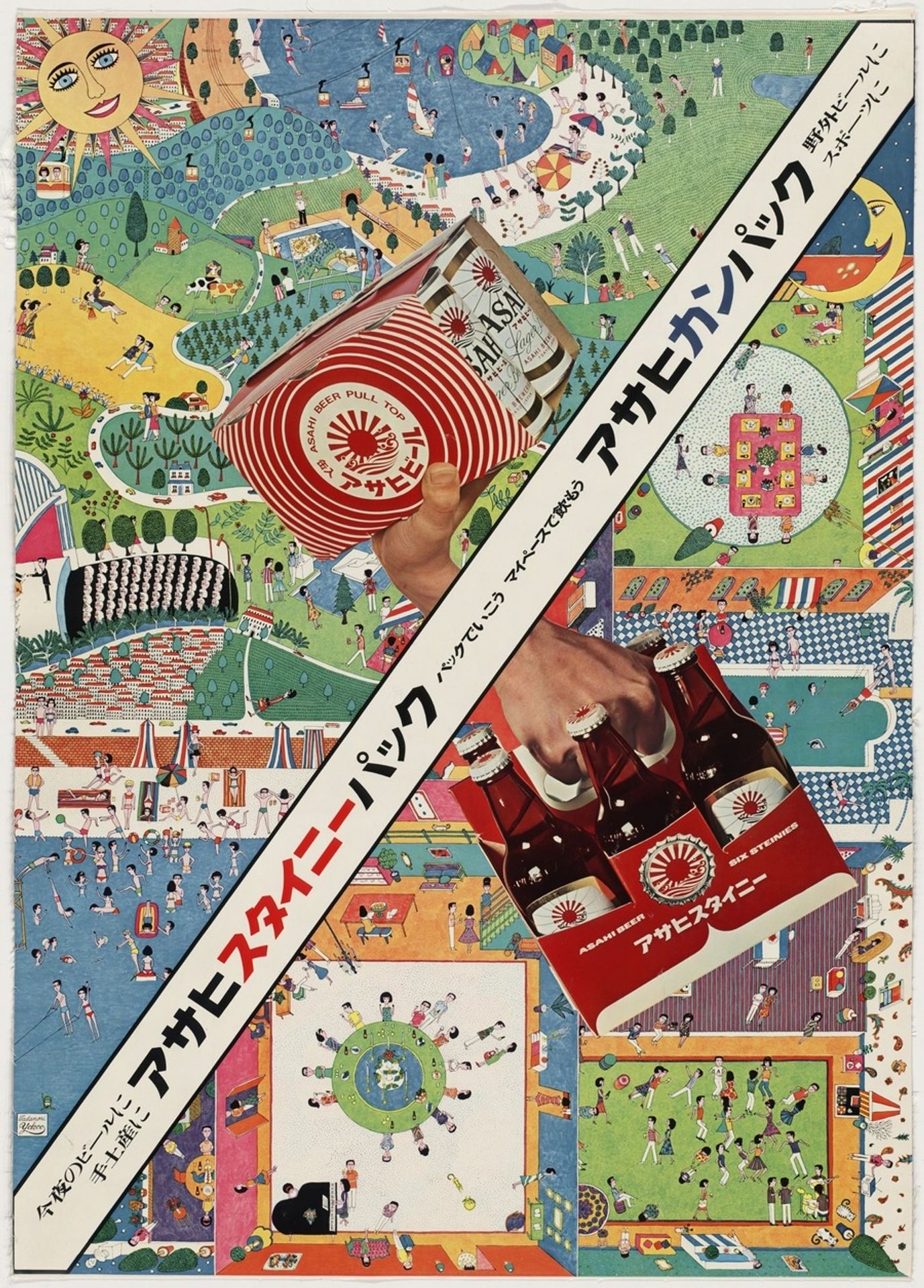
Curator: Tadanori Yokoo's 1966 mixed-media work, “Asahi Beer,” presents us with a vibrant and intriguing take on advertising art. What are your first thoughts on this poster? Editor: It's intensely busy, isn’t it? A kaleidoscopic blend of figures, patterns, and products vying for attention. There's an almost dizzying effect, like a visual overload that's both chaotic and… oddly pleasing. Curator: Indeed. Yokoo’s process here seems deeply rooted in the booming consumer culture of post-war Japan. Consider the blend of hand-drawn elements, collage, and graphic design. The poster utilizes mixed-media as a commentary of that period's social fabric that emphasizes leisure activities with this brand in mind. Editor: I see that. Structurally, there's this forceful diagonal that cuts across the scene, creating a sharp division and dynamic tension, between, shall we say, two panels, or is it three? One contains what looks like active leisure pursuits like soccer games or swimming, and the other…are those family gatherings? It is incredibly complex for such a seemingly straightforward advertisement. Curator: And consider the material context. Asahi beer—this work was very intentional by being plastered around Japan; an accessible luxury encouraging communal activities with this ubiquitous mass-produced beverage to reinforce its branding. Its widespread use reflects a shift in Japanese society towards embracing western-style leisure. Editor: That’s an interesting point. Thinking of semiotics and structure now…The sun and moon figures remind me of those used in older art, maybe even Japanese scroll paintings or woodblock prints, positioned almost like celestial guardians. How does it fit into understanding what’s happening? Curator: These images serve to further encourage Japanese culture, in advertising but also subtly elevating an everyday product. This juxtaposition would elevate the poster to high art through traditional means. This artwork's power comes from its simultaneous embrace and subversion of traditional boundaries of fine art with accessibility. Editor: Looking at the visual rhythm created by repeated circular forms such as the Asahi logo, those group table arrangements and smiling Sun in the top corner…It feels deliberate, drawing our eyes across this jumbled but controlled panorama. In its totality, this graphic poster becomes quite a striking design that's much more complex than at first glance! Curator: Yes, precisely! The complex use of advertising through social implications makes for a more memorable experience. Editor: Agreed. It seems almost like the poster encourages people to purchase memories and communal fun.